How Durable Are Democrats' Gains in Georgia?
library(tidyverse)
library(tidycensus)
library(sf)
library(lubridate)
library(janitor)
library(GGally)
library(patchwork)
library(gt)
library(srvyr)
There have been roughly eight billion articles analyzing data from the 2020 election, specifically in Georgia, where I was born and currently live.
The thing I wonder about the most though is how durable Democrats’ gains are in the suburbs. The suburbs were a critical part of Biden (and Warnock and Ossoff’s) success. As FiveThirtyEight wrote in a big article about the suburbs in December:
Suburban and exurban counties turned away from Trump and toward Democrat Joe Biden in states across the country, including in key battleground states like Pennsylvania and Georgia. In part, this may be because the suburbs are simply far more diverse than they used to be. But suburbs have also become increasingly well-educated — and that may actually better explain why so many suburbs and exurbs are turning blue than just increased diversity on its own.
But what if these voters were primarily voting against Trump and not for Biden? What if these suburban counties, which contain a large number of Romney-Clinton voters and might be more open to GOP economic arguments about tax cuts and deregulation, shift back to the red-ish hues of purple now that Trump is out of office?
So in this post I’ll break down the 2020 Georgia vote for Biden, and then for Ossoff and Warnock in the 5 January special election, into three categories:
- 2020 Georgia Presidential vote: Compared with Georgia in 2016 and with the rest of the 2020 vote across the country
- 2020 Georgia Senate special election: Compared with Biden’s 2020 margins
- Survey data from the Democracy Fund / UCLA Nationscape study on suburban voters’ attitudes
2020 Presidential Vote
Alright, to start with we’ll pull demographic data by county from the latest American Community Survey using the amazing tidycensus package. I’ll download the sf geometries for some mapping as well.
## acs
acs <- get_acs(geography = "county",
               variables = c(tot_pop = "B01003_001",
                             age_male = "B01002_002",
                             age_female = "B01002_003",
                             ba = "B15003_022",
                             ma = "B15003_023",
                             pd = "B15003_024",
                             phd = "B15003_025",
                             poverty = "B17001_001",
                             medicaid = "C27007_001",
                             tot_white = "B02001_002",
                             tot_black = "B02001_003",
                             tot_ai = "B02001_004",
                             tot_asian = "B02001_005",
                             born_other_state = "B06001_025",
                             income = "B19127_001"),
              year = 2019,
              geometry = TRUE)

acs2 <- acs %>%
    st_drop_geometry() %>%
    clean_names() %>%
    pivot_wider(names_from = variable, values_from = estimate, id_cols = name) %>%
    left_join(st_drop_geometry(acs) %>%
                  clean_names() %>%
                  separate(name, into = c("county", "state"),
                           sep = ", ", remove = FALSE) %>%
                  select(name, county, state)) %>%
    relocate(state, county) %>%
    distinct() %>%
    left_join(fips_codes %>%
                  select(-state) %>%
                  unite(fips_code, c(state_code, county_code), sep = ""),
              by= c("state" = "state_name", "county")) %>%
    mutate(medicaid_perc = medicaid / tot_pop,
           pov_perc = poverty / tot_pop,
           college = ba + ma + pd + phd,
           college_perc = college / tot_pop,
           white_perc = tot_white / tot_pop,
           black_perc = tot_black / tot_pop,
           ai_perc = tot_ai / tot_pop,
           asian_perc = tot_asian / tot_pop,
           other_state_perc = born_other_state / tot_pop,
           income_per_cap = income / tot_pop)
Then I’ll pull in the 2020 presidential voting data by county from a few helpful GitHub sites. Note that Alaska presents some difficulties because its election returns are variously reported by either state house districts (where there are 40) and by boroughs (where there are 19, plus 11 census areas within an unorganized district). While I standardized the results for the 2016 and 2020 elections by district for Alaska, the ACP data is by borough (and 2020 election data hasn’t been updated by borough yet), so Alaska data isn’t included in the ACP comparison charts below.
states <- tibble(state.abb, state.name, state.region) %>%
    rename(state = state.name)

pres20 <- read_csv("https://github.com/tonmcg/US_County_Level_Election_Results_08-20/raw/master/2020_US_County_Level_Presidential_Results.csv") %>%
    mutate(election = 2020) %>%
    left_join(states, by = c("state_name" = "state")) %>%
    rename(fips_code = county_fips, county = county_name,
           state_abbr = state.abb, state = state_name) %>%
    mutate(dem_margin = per_dem - per_gop)


alaska <- read_csv("https://github.com/MEDSL/county-returns/blob/master/countypres_2000-2016.csv?raw=true") %>%
    clean_names() %>%
    filter(state == "Alaska",
           year == 2016) %>%
    select(state, county, party, candidate_votes = candidatevotes,
           total_votes = totalvotes) %>%
    mutate(party_perc = candidate_votes / total_votes) %>%
    pivot_wider(names_from = party, values_from = party_perc, id_cols = county) %>%
    rename(per_dem = democrat, per_gop = republican) %>%
    mutate(dem_margin = per_dem - per_gop,
           state = "Alaska",
           election = 2016) %>%
    select(-"NA") %>%
    filter(county != "District 99") %>%
    bind_cols(pres20 %>% filter(state == "Alaska") %>% select(fips_code))


pres16 <- read_csv("https://github.com/tonmcg/US_County_Level_Election_Results_08-20/raw/master/2016_US_County_Level_Presidential_Results.csv") %>%
    left_join(states, by = c("state_abbr" = "state.abb")) %>%
    rename(county = county_name) %>%
    mutate(per_point_diff = parse_number(per_point_diff),
           per_point_diff = per_point_diff / 100,
           election = 2016,
           fips_code = if_else(str_length(combined_fips) == 4,
                                   paste0(0, combined_fips),
                                   as.character(combined_fips)),
           dem_margin = per_dem - per_gop,
           county = if_else(fips_code == "46113", "Oglala Lakota County", county),
           fips_code = if_else(fips_code == "46113", "46102", fips_code)) %>%
    select(-c(X1, combined_fips)) %>%
    distinct() %>%
    filter(state != "Alaska") %>%
    bind_rows(alaska)
## Warning: Missing column names filled in: 'X1' [1]pres <- pres20 %>%
bind_rows(pres16) %>%
mutate(election = paste0("dem_perc", election),
state_county = paste(state, county, sep = "_")) %>%
pivot_wider(names_from = election, values_from = c(per_dem, total_votes, dem_margin),
id_cols = fips_code) %>%
left_join(pres20 %>% select(state, county, fips_code)) %>%
rename(total_votes20 = 4, total_votes16 = 5,
dem_perc20 = 2, dem_perc16 = 3,
dem_margin20 = 6, dem_margin16 = 7) %>%
mutate(dem_perc_dif = dem_perc20 - dem_perc16,
dem_margin_dif = (dem_margin20 - dem_margin16),
total_votes_dif = total_votes20 - total_votes16) %>%
relocate(state, county) One of the articles that made me want to dig into this data myself was from Bloomberg (as seen in New York Magazine), which used county classifications from the American Communities Project to see how types of counties shifted their votes from 2016 to 2020.
The ACP data is really interesting – from the methodology page is sounds like they did some k-means clustering of 36 different county-level variables to find 15 different county types – things like “Exurbs” and “Military Hubs”, but also “Evangelical Hubs” and “Aging Farmlands”. These aren’t mutually-exclusive categories (i.e. there might be suburban counties that are tagged as Military Posts, for example), but they’re still useful categories for how we actually think about communities across the country.
For example, Chattahoochee County is home to Ft. Benning, a U.S. Army base near Columbus, GA. It’s a rural part of the state, but near medium-sized Columbus. With Ft. Benning in its borders, Chattahoochee County (and neighboring Muscogee County) has a distinct feel compared with other medium-sized cities in rural counties, and “Military Hub” captures its feel more than simply a classification based on just population density.
communities <- readxl::read_xlsx("C:\\Users\\ChadPeltier\\Downloads\\County-Type-Share.xlsx") %>%
    clean_names()

communities_key <- communities %>%
    slice_head(n = 15) %>%
    select(key, new_names)

communities2 <- communities %>%
    left_join(communities_key, by = c("type_number_2" = "key")) %>%
    rename(acp_county_type = new_names.y, fips_code = fips) %>%
    select(3,8) %>%
    mutate(fips_code = if_else(str_length(fips_code) == 4, paste0(0, fips_code),
                              as.character(fips_code)),
           fips_code = as.character(fips_code))
However, it’s also useful to have an alternative county classification system with mutually-exclusive boundaries to use as well. Here’s the NCHS county codes data from the CDC:
nchs <- readxl::read_xlsx("C:\\Users\\ChadPeltier\\Downloads\\NCHSURCodes2013.xlsx") %>%
    clean_names() %>%
    rename(nchs_code = 7) %>%
    mutate(fips_code = if_else(str_length(fips_code) == 4, paste0(0, fips_code),
                              as.character(fips_code)),
           fips_code = as.character(fips_code),
           nchs_code = case_when(nchs_code == 1 ~ "Large central metro",
                                 nchs_code == 2 ~ "Large fringe metro",
                                 nchs_code == 3 ~ "Medium metro",
                                 nchs_code == 4 ~ "Small metro",
                                 nchs_code == 5 ~ "Micropolitan",
                                 nchs_code == 6 ~ "Noncore")) %>%
    select(fips_code, nchs_code)
Finally we can combine all of these together into a single dataframe.
combined <- pres %>%
    left_join(acs2 %>% select(-c(state, county)), by = "fips_code") %>%
    left_join(communities2) %>%
    left_join(nchs) %>%
    mutate(turnout20 = total_votes20 / tot_pop,
           turnout16 = total_votes16 / tot_pop,
           turnout_dif = turnout20 - turnout16) %>%
    relocate(name, county, nchs_code, acp_county_type)

ga <- combined %>%
    filter(state == "Georgia") %>%
    mutate(county = str_remove(county, " County"))
Let’s make some charts!
Ok, we’ll start off with a recreation of the Bloomberg chart, but with three variations. Essentially the charts below show Democrats’ margins by ACP county type for both Georgia counties only and the entire US, for both 2020 margins only, and 2020 Democrat margins compared with 2016 Democrat margins.
## Dem margin shift 2020-2016
p1 <- ga %>%
    group_by(acp_county_type) %>%
    summarize(dem_margin_dif = mean(dem_margin_dif, na.rm = TRUE)) %>%
    drop_na() %>%
    ggplot(aes(dem_margin_dif, reorder(acp_county_type, dem_margin_dif),
               color = cut(dem_margin_dif, c(-Inf, 0, 0.03, Inf)))) +
    geom_point(size = 2) +
    geom_segment(aes(x = 0, xend = dem_margin_dif, y = acp_county_type,
                     yend = acp_county_type), size = 1) +
    scale_x_continuous(labels = scales::percent_format()) +
    labs(y = "", x = "", title = "GA Democratic Shifts in 2020 by County",
         subtitle = "Difference in vote margin between 2016 and 2020") +
    scale_color_manual(values = c("(-Inf,0]" = "red",
                                  "(0,0.03]" = "purple",
                                  "(0.03, Inf]" = "royalblue")) +
    theme(legend.position = "none")
## `summarise()` ungrouping output (override with `.groups` argument)p2 <- combined %>%
group_by(acp_county_type) %>%
summarize(dem_margin_dif = mean(dem_margin_dif, na.rm = TRUE)) %>%
drop_na() %>%
ggplot(aes(dem_margin_dif, reorder(acp_county_type, dem_margin_dif),
color = cut(dem_margin_dif, c(-Inf, 0, 0.03, Inf)))) +
geom_point(size = 2) +
geom_segment(aes(x = 0, xend = dem_margin_dif, y = acp_county_type, yend = acp_county_type), size = 1) +
scale_x_continuous(labels = scales::percent_format()) +
labs(y = "", x = "", title = "US Democratic Shifts in 2020 by County",
subtitle = "Difference in vote margin between 2016 and 2020") +
scale_color_manual(values = c("(-Inf,0]" = "red",
"(0,0.03]" = "purple",
"(0.03, Inf]" = "royalblue")) +
theme(legend.position = "none") ## `summarise()` ungrouping output (override with `.groups` argument)## Dem Margin in 2020
p3 <- ga %>%
group_by(acp_county_type) %>%
summarize(dem_margin20 = mean(dem_margin20, na.rm = TRUE)) %>%
drop_na() %>%
ggplot(aes(dem_margin20, reorder(acp_county_type, dem_margin20),
color = cut(dem_margin20, c(-Inf, -0.025, 0.025, Inf)))) +
geom_point(size = 2) +
geom_segment(aes(x = 0, xend = dem_margin20, y = acp_county_type, yend = acp_county_type), size = 1) +
scale_x_continuous(labels = scales::percent_format()) +
labs(y = "", x = "", title = "GA 2020 Democrat Margin by County") +
scale_color_manual(values = c("(-Inf,-0.025]" = "red",
"(-0.025,0.025]" = "purple",
"(0.025, Inf]" = "royalblue")) +
theme(legend.position = "none") ## `summarise()` ungrouping output (override with `.groups` argument)p4 <- combined %>%
group_by(acp_county_type) %>%
summarize(dem_margin20 = mean(dem_margin20, na.rm = TRUE)) %>%
drop_na() %>%
ggplot(aes(dem_margin20, reorder(acp_county_type, dem_margin20),
color = cut(dem_margin20, c(-Inf, -0.025, 0.025, Inf)))) +
geom_point(size = 2) +
geom_segment(aes(x = 0, xend = dem_margin20, y = acp_county_type, yend = acp_county_type), size = 1) +
scale_x_continuous(labels = scales::percent_format()) +
labs(y = "", x = "", title = "US 2020 Democrat Margin by County") +
scale_color_manual(values = c("(-Inf,-0.025]" = "red",
"(-0.025,0.025]" = "purple",
"(0.025, Inf]" = "royalblue")) +
theme(legend.position = "none") ## `summarise()` ungrouping output (override with `.groups` argument)p1 + p2 + p3 + p4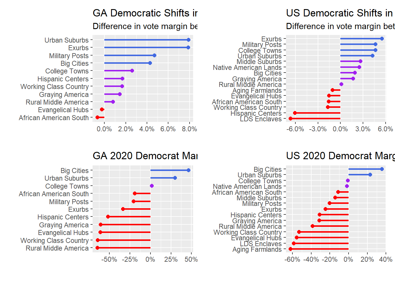
#ggsave("test.png", width = 16/1.2, height = 9/1.2)So the top two charts compare Democratic margins in 2020 with 2016, for both the entire US and Georgia-only. The bottom two charts look at Democrats’ margins in 2020 only for the US and Georgia-only. Lots of takeaways here:
- As a national baseline, Democrats relied on big cities and urban suburbs in 2020, along with 50-50 performances in college towns and Native American lands. That’s kind of astounding, and speaks to the intense geographic polarization in the US right now. Despite winning the popular vote in seven of the last eight elections, including by 4.5% in 2020, Democrats only won two of 15 different types of counties.
- While Democrats relied on big cities and their suburbs for Biden’s win, the biggest movements nationally were in exurbs, military posts, and college towns, followed closely by urban suburbs. What’s interesting there is that urban suburbs were really the stars of the 2020 show for Democrats. Not only did they have the 4th-largest swing in Democrats’ favor compared with 2016, but Democrats also had a positive margin in these counties overall. The same can’t be said for exurbs, military hubs, and college towns, where Democrats had negative margins nationally, so the large swings in these counties were more about shoring up weaknesses than actually getting in the black.
- The 2020-only Georgia chart looks very similar to the national chart, with the exception that college towns are very slightly in Democrats’ favor (thanks to Athens).
- But the 2020-2016 Georgia-only comparison chart looks much different. Democrats gained in all but two county types (Evangelical Hubs and the African American South), with gigantic gains in urban suburbs and exurbs. In fact, exurb Forsyth County, where I grew up and my parents still live, had the third-largest swing (14.5%) in Democratic 2020-2016 margin of counties in Georgia. Democrats still only captured 32.6% of the vote there, but that’s nevertheless a remarkable swing for a county that had the Democrats almost 48% underwater in 2016.
- This chart also helps confirm what many other data analysts have already noted – that Georgia Democrats can thank a combination of counties with high Black populations (typically in Atlanta’s southern suburbs like Henry and Rockdale counties) along with northern Atlanta suburbs shifting decidedly to the Democrats.
The chart below shows Georgia’s 2020 Democratic margins by county, but without grouping by county type first, and with sizing the points based on the total number of 2020 votes.
ga %>%
    ggplot(aes(dem_margin20, reorder(acp_county_type, dem_margin20),
               color = cut(dem_margin20, c(-Inf, -0.025, 0.025, Inf)))) +
    geom_point(aes(alpha = 0.3, size = total_votes20)) +
    #geom_boxplot() +
    ggrepel::geom_text_repel(data = ga %>% filter(total_votes20 > 200000), aes(label = county)) +
    scale_x_continuous(labels = scales::percent_format()) +
    labs(y = "", x = "", title = "GA 2020 Democrat Margin by County") +
    geom_vline(xintercept = 0, linetype = "dashed") +
    scale_color_manual(values = c("(-Inf,-0.025]" = "red",
                                  "(-0.025,0.025]" = "purple",
                                  "(0.025, Inf]" = "royalblue")) +
theme(legend.position = "none") 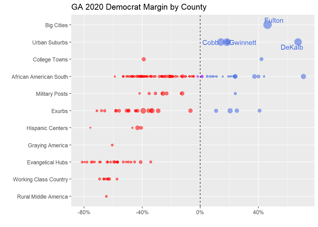
Here again we can see the impact from large suburbs like Dekalb (my home county), Gwinnett, and Cobb (where the Braves’ stadium is located) counties. Notably, Democrats didn’t win a single county classified as a Hispanic Center, Graying America (of which there was only one in Georgia), Evangelical Hub (of which there are many), Working Class County, or Rural Middle America (again, with only one example in Georgia).
Turnout was a little bit of a different story. While exurbs and big cities had the biggest increases (which was crucial for Democrats, since exurbs were Democrats’ largest improvement and big cities are Democrats’ base), Graying America and Working Class Counties were third and fourth in turnout increases, which is why the overall margin was still so tight:
## Turnout diff
ga %>%
    group_by(acp_county_type) %>%
    summarize(turnout_dif = mean(turnout_dif, na.rm = TRUE)) %>%
    drop_na() %>%
    ggplot(aes(turnout_dif, reorder(acp_county_type, turnout_dif),
               color = turnout_dif)) +
    geom_point(size = 2) +
    geom_segment(aes(x = 0, xend = turnout_dif, y = acp_county_type, yend = acp_county_type), size = 1) +
    labs(y = "", x = "", title = "GA Turnout Shifts in 2020 by County",
         subtitle = "Difference in total turnout between 2016 and 2020") +
    theme(legend.position = "none")  +
    scale_x_continuous(labels = scales::percent_format())
## `summarise()` ungrouping output (override with `.groups` argument)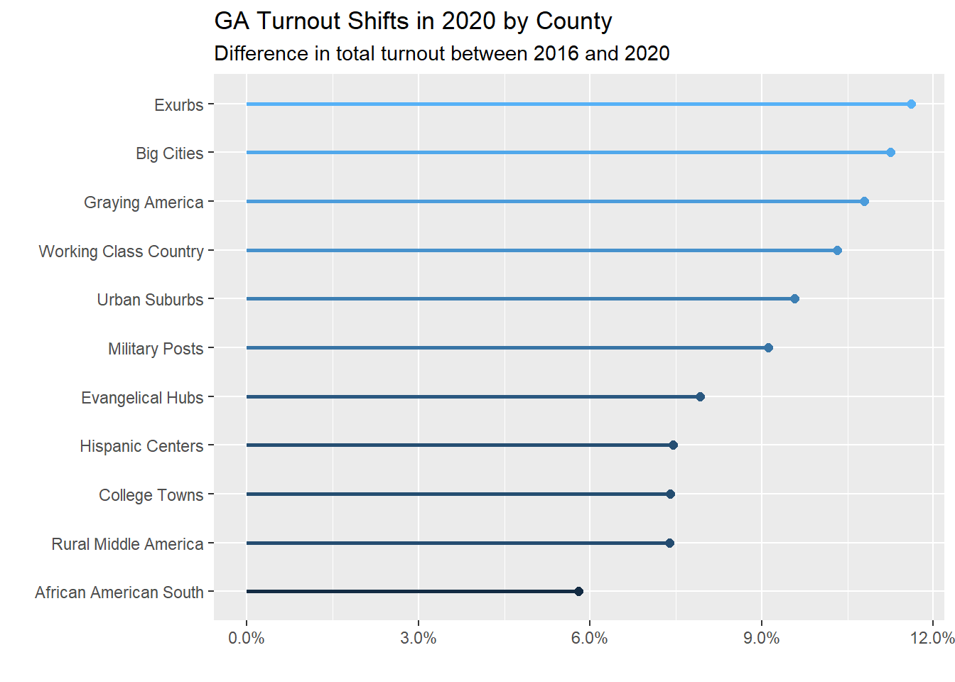
We can do a similar analysis just using ACS demographic data. This is inspired by the precinct-level chart in this NYT article.
ga %>%
    summarize(maj_black = mean(dem_margin_dif[black_perc > 0.5]),
              rural = mean(dem_margin_dif[nchs_code == "Noncore"]),
              suburban = mean(dem_margin_dif[acp_county_type == "Urban Suburbs"]),
              urban = mean(dem_margin_dif[acp_county_type == "Big Cities"]),
              white_working = mean(dem_margin_dif[white_perc >= .8 & college_perc <= .25]),
              maj_college = mean(dem_margin_dif[college >= 0.5])) %>%
    pivot_longer(everything()) %>%
    ggplot(aes(value, reorder(name, value),
               color = cut(value, c(-Inf, -0.012, 0.012, Inf)))) +
    geom_point(size = 2) +
    geom_segment(aes(x = 0, xend = value, y = name, yend = name), size = 1) +
    scale_x_continuous(labels = scales::percent_format()) +
    labs(y = "", x = "", title = "GA Democrat Margin 2020 vs. 2016 by Group") +
    scale_color_manual(values = c("(-Inf,-0.012]" = "red",
                                  "(-0.012,0.012]" = "purple",
                                  "(0.012, Inf]" = "royalblue")) +
theme(legend.position = "none") 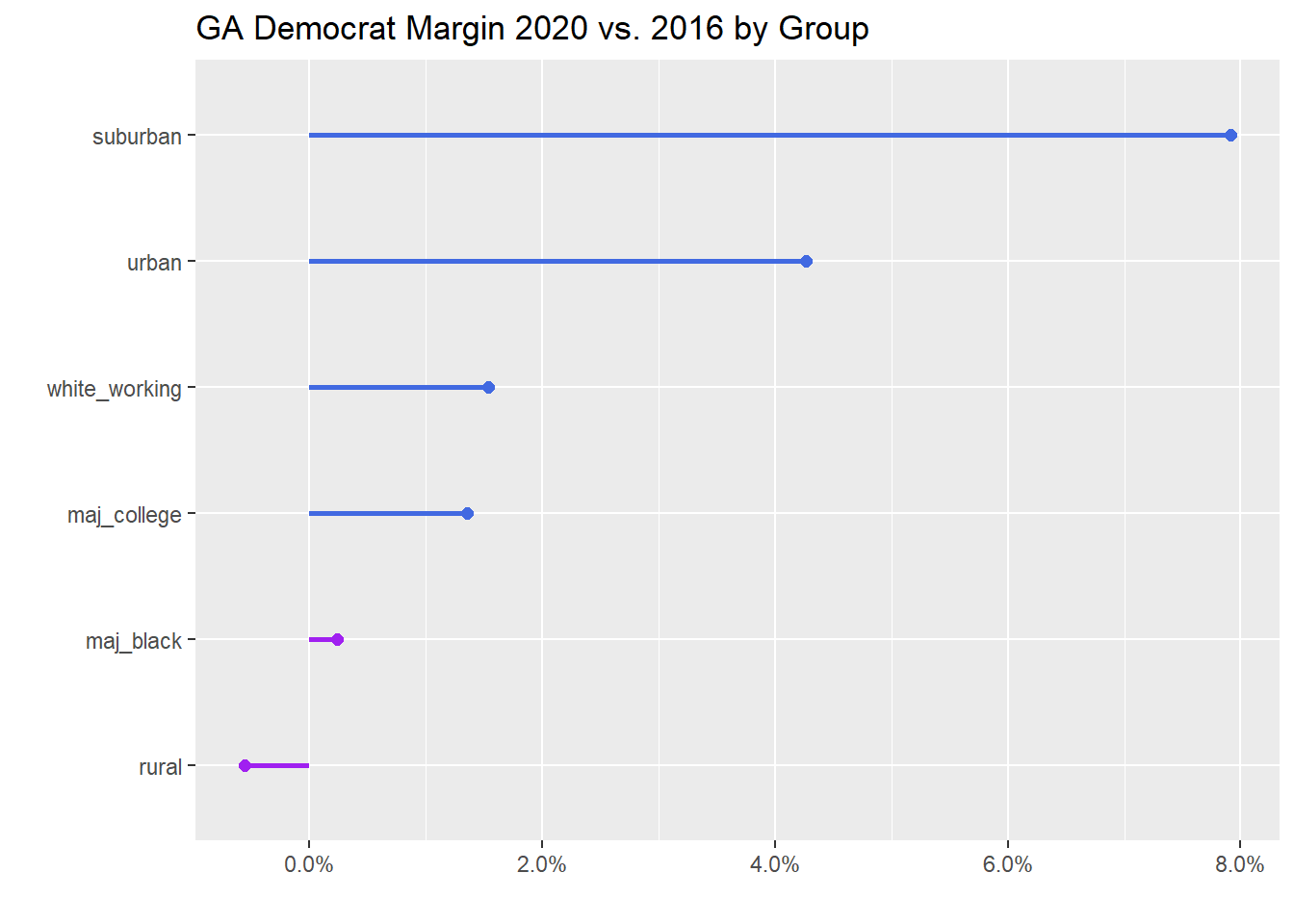
Map Time
Alright, let’s make some maps. We’ll bring in that ACS dataframe with the county boundaries as simple features first.
acs_sf <- acs %>%
    clean_names() %>%
    separate(name, into = c("county", "state"),
                           sep = ", ", remove = FALSE) %>%
                  select(name, county, state) %>%
    filter(state == "Georgia") %>%
    left_join(fips_codes %>%
                  select(-state) %>%
                  rename(state = state_name) %>%
                  unite(fips_code, state_code, county_code, sep = "")) %>%
    select(fips_code, geometry) %>%
    distinct(fips_code)

ga_sf <- acs_sf %>%
    left_join(ga)
Next, let’s take a look at Metro Atlanta counties, just to get a sense of which counties are where.
ga_sf %>%
    filter(acp_county_type %in% c("Urban Suburbs", "Exurbs", "Big Cities")) %>%
    ggplot() +
    geom_sf() +
    geom_sf(aes(fill = acp_county_type)) +
    theme(panel.grid.major = element_blank(),
          panel.grid.minor = element_blank(),
          panel.border = element_blank(),
          panel.background = element_blank(),
          axis.ticks = element_blank(),
          axis.text = element_blank()) +
    labs(x = "", y = "") +
    #scale_fill_viridis_d(direction = -1) +
    geom_text(aes(label = county, geometry = geometry),
              #color = "white",
              size = 3,
              stat = "sf_coordinates") +
     coord_sf(xlim = c(-85.484619,-83.111573),
             ylim = c(33.275436,34.524662))
## Warning in st_point_on_surface.sfc(sf::st_zm(x)): st_point_on_surface may not
## give correct results for longitude/latitude data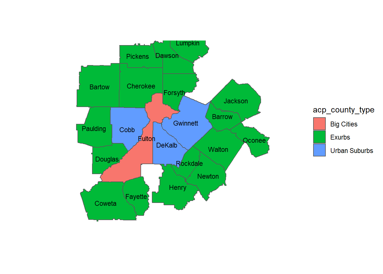
Alright, now we can make some maps showing Democrats’ margins and turnout in 2020 and in comparison with 2016. I did a little reading about how election result maps are drawn. Apparently the “everything is purple” maps have their own downsides, even if we know that simple red-and-blue-only-states maps obscure a lot of important information. As a result I decided on a blue-red color gradient that uses a gray/white in the middle of the scale. There, it’s much easier to differentiate the gradients for both red- and blue-leaning counties.
p1 <- ga_sf %>%
    ggplot() +
    geom_sf() +
    geom_sf(aes(fill = dem_margin20)) +
    theme_void() +
    scale_fill_gradient2(low = "#ca0020", high = "#0571b0",
                         labels = scales::percent_format()) +
    labs(title = "Democratic Margin 2020") +
    theme(legend.title = element_blank())

p2 <- ga_sf %>%
    ggplot() +
    geom_sf() +
    geom_sf(aes(fill = dem_margin_dif)) +
    theme_void() +
    scale_fill_gradient2(low = "#ca0020", high = "#0571b0",
                         labels = scales::percent_format()) +
    labs(title = "Democratic Margin Difference 2020-2016") +
    theme(legend.title = element_blank())

p3 <- ga_sf %>%
    ggplot() +
    geom_sf() +
    geom_sf(aes(fill = turnout20)) +
    theme_void() +
    scale_fill_fermenter(palette = "Blues", direction = 1,
                         labels = scales::percent_format()) +
    labs(title = "Turnout 2020") +
    theme(legend.title = element_blank())


p1 + p2
#ggsave("ga_maps2.png", width = 16/1.2, height = 9/1.2)

p3 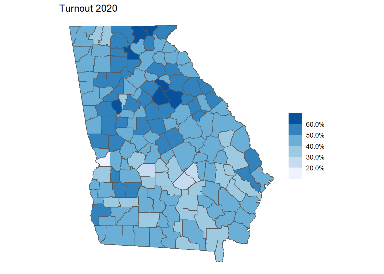
#ggsave("ga_maps.png", width = 16/1.2, height = 9/1.2)The analysis by ACP county types above is really helpful for understanding how Georgia became a blue state in 2020, but I think it’s also useful to see the geographic separation between red and blue Georgia in map form. Here it’s easy to see that Democrats rely on metro Atlanta and its surrounding suburbs, while also getting significant margins from counties with significant Black turnout in middle Georgia. But the margin difference map is pretty astounding. While many counties didn’t flip entirely for the Democrats, they gained enough ground across the entire state to put Biden over the edge. And the impact of suburban Atlanta is never more clear than in this map, where the deepest blues surround Fulton County.
ga %>%
    select(county, acp_county_type, dem_margin20, dem_margin_dif) %>%
    arrange(desc(dem_margin_dif)) %>%
    # slice_head(n = 10) %>%
    gt(rowname_col = vars(county)) %>%
    tab_header(title = "Georgia 2020 Presidential by County") %>%
    cols_label(acp_county_type = "County Type", county = "County",
               dem_margin20 = "Democrat Margin 2020",
               dem_margin_dif = "Democrat Margin 2020 - 2016") %>%
    fmt_percent(columns = vars(dem_margin20, dem_margin_dif)) %>%
    data_color(columns = vars(dem_margin20),
               colors = scales::col_bin(palette = c("red2", "blue2"),
                                        bins = 2,
domain = c(-40,40)))| Georgia 2020 Presidential by County | |||
|---|---|---|---|
| County | County Type | Democrat Margin 2020 | Democrat Margin 2020 - 2016 |
| Henry | Exurbs | 20.48% | 16.13% |
| Rockdale | Exurbs | 40.78% | 14.86% |
| Forsyth | Exurbs | −33.19% | 14.47% |
| Douglas | Exurbs | 25.12% | 14.37% |
| Fayette | Exurbs | −6.80% | 12.71% |
| Gwinnett | Urban Suburbs | 18.26% | 12.52% |
| Cobb | Urban Suburbs | 14.33% | 12.24% |
| Paulding | Exurbs | −29.08% | 12.17% |
| Columbia | Military Posts | −25.79% | 11.91% |
| Cherokee | Exurbs | −39.23% | 10.77% |
| Houston | Military Posts | −12.43% | 9.22% |
| Newton | Exurbs | 10.92% | 8.57% |
| Lee | Exurbs | −44.57% | 8.42% |
| Bryan | Military Posts | −35.16% | 8.01% |
| Hall | Hispanic Centers | −43.24% | 7.42% |
| Barrow | Exurbs | −43.12% | 7.27% |
| Walton | Exurbs | −49.24% | 7.20% |
| Coweta | Exurbs | −35.54% | 6.77% |
| Oconee | Exurbs | −33.51% | 6.60% |
| Webster | African American South | −7.76% | 6.51% |
| Lowndes | African American South | −12.03% | 6.15% |
| Effingham | Exurbs | −49.55% | 6.08% |
| Jackson | Exurbs | −58.02% | 5.86% |
| Glynn | Military Posts | −23.19% | 5.44% |
| Muscogee | African American South | 24.02% | 5.43% |
| Richmond | African American South | 37.17% | 4.79% |
| Catoosa | Exurbs | −55.95% | 4.75% |
| Bartow | Exurbs | −50.69% | 4.51% |
| Long | Military Posts | −26.37% | 4.46% |
| Dawson | Exurbs | −67.86% | 4.37% |
| Chatham | Urban Suburbs | 18.75% | 4.27% |
| Fulton | Big Cities | 46.39% | 4.27% |
| Whitfield | Hispanic Centers | −40.70% | 4.06% |
| Clarke | College Towns | 42.08% | 4.03% |
| Tift | African American South | −33.58% | 3.84% |
| Madison | Evangelical Hubs | −52.99% | 3.70% |
| Bibb | African American South | 23.83% | 3.61% |
| Rabun | Working Class Country | −57.38% | 3.56% |
| Harris | Exurbs | −44.33% | 3.55% |
| Spalding | African American South | −20.77% | 3.47% |
| Pickens | Exurbs | −65.74% | 3.45% |
| Gilmer | Working Class Country | −63.52% | 3.42% |
| Miller | African American South | −46.51% | 3.34% |
| Oglethorpe | African American South | −38.77% | 3.23% |
| Camden | Military Posts | −30.74% | 3.11% |
| Early | African American South | −5.01% | 3.08% |
| Wilkes | African American South | −13.18% | 3.04% |
| Liberty | Military Posts | 24.05% | 2.87% |
| DeKalb | Urban Suburbs | 67.37% | 2.62% |
| Sumter | African American South | 4.78% | 2.55% |
| Floyd | Evangelical Hubs | −41.09% | 2.46% |
| White | Working Class Country | −66.22% | 2.42% |
| Habersham | Evangelical Hubs | −64.00% | 2.35% |
| Thomas | African American South | −19.48% | 2.34% |
| Walker | Evangelical Hubs | −59.29% | 2.22% |
| Union | Working Class Country | −63.31% | 2.20% |
| Worth | Evangelical Hubs | −47.77% | 2.19% |
| Lumpkin | Exurbs | −58.19% | 1.83% |
| Wayne | Evangelical Hubs | −57.12% | 1.75% |
| Dougherty | African American South | 40.03% | 1.72% |
| Toombs | Evangelical Hubs | −45.22% | 1.71% |
| Decatur | African American South | −16.97% | 1.64% |
| Troup | African American South | −21.85% | 1.59% |
| Candler | African American South | −42.07% | 1.53% |
| Ben Hill | African American South | −26.17% | 1.45% |
| Towns | Graying America | −60.58% | 1.43% |
| Ware | African American South | −40.41% | 1.33% |
| Quitman | African American South | −9.67% | 1.25% |
| Montgomery | African American South | −49.91% | 1.24% |
| Grady | African American South | −31.90% | 1.22% |
| Stephens | Evangelical Hubs | −58.74% | 1.17% |
| Carroll | College Towns | −38.99% | 1.15% |
| Gordon | Working Class Country | −62.50% | 1.13% |
| Appling | Evangelical Hubs | −57.04% | 0.90% |
| Laurens | African American South | −28.24% | 0.88% |
| Tattnall | African American South | −48.77% | 0.86% |
| Fannin | Working Class Country | −64.64% | 0.83% |
| Upson | Evangelical Hubs | −34.12% | 0.82% |
| Jones | African American South | −33.87% | 0.82% |
| Dade | Rural Middle America | −64.64% | 0.80% |
| Polk | Evangelical Hubs | −57.08% | 0.43% |
| Banks | Evangelical Hubs | −77.98% | 0.43% |
| Clay | African American South | 10.73% | 0.42% |
| Turner | African American South | −24.80% | 0.31% |
| Bleckley | African American South | −52.86% | 0.31% |
| Washington | African American South | 0.79% | 0.21% |
| Butts | African American South | −43.60% | 0.20% |
| Colquitt | African American South | −47.17% | 0.16% |
| Dodge | African American South | −45.48% | 0.05% |
| Berrien | Working Class Country | −66.51% | 0.03% |
| Jenkins | African American South | −25.90% | −0.06% |
| Taliaferro | African American South | 21.66% | −0.19% |
| Cook | African American South | −40.38% | −0.25% |
| Bulloch | African American South | −23.73% | −0.27% |
| Morgan | African American South | −41.67% | −0.32% |
| Murray | Working Class Country | −69.16% | −0.40% |
| Baldwin | African American South | 1.30% | −0.41% |
| Coffee | African American South | −39.88% | −0.41% |
| McDuffie | African American South | −19.14% | −0.44% |
| Lanier | Military Posts | −41.67% | −0.46% |
| Greene | African American South | −26.49% | −0.52% |
| Mitchell | African American South | −10.51% | −0.58% |
| Jeff Davis | Evangelical Hubs | −63.54% | −0.64% |
| Glascock | Evangelical Hubs | −79.68% | −0.76% |
| Putnam | African American South | −40.85% | −0.87% |
| Franklin | Evangelical Hubs | −69.45% | −0.87% |
| McIntosh | African American South | −20.97% | −0.88% |
| Telfair | African American South | −30.85% | −0.91% |
| Clayton | African American South | 70.91% | −1.00% |
| Terrell | African American South | 8.42% | −1.03% |
| Stewart | African American South | 19.15% | −1.07% |
| Pierce | Evangelical Hubs | −75.14% | −1.17% |
| Lincoln | African American South | −37.51% | −1.22% |
| Irwin | Evangelical Hubs | −51.01% | −1.24% |
| Screven | African American South | −18.92% | −1.29% |
| Monroe | African American South | −42.80% | −1.37% |
| Evans | African American South | −36.83% | −1.46% |
| Pike | Exurbs | −71.10% | −1.54% |
| Atkinson | Hispanic Centers | −46.75% | −1.55% |
| Elbert | African American South | −36.50% | −1.59% |
| Emanuel | African American South | −38.58% | −1.62% |
| Peach | African American South | −4.65% | −1.64% |
| Calhoun | African American South | 15.47% | −1.78% |
| Pulaski | African American South | −38.84% | −1.82% |
| Brooks | African American South | −20.70% | −1.96% |
| Charlton | African American South | −50.66% | −2.10% |
| Wilkinson | African American South | −12.39% | −2.12% |
| Johnson | African American South | −39.71% | −2.15% |
| Randolph | African American South | 9.14% | −2.15% |
| Crisp | African American South | −24.93% | −2.21% |
| Treutlen | African American South | −37.34% | −2.23% |
| Wheeler | African American South | −39.12% | −2.26% |
| Haralson | Evangelical Hubs | −73.98% | −2.36% |
| Chattahoochee | Military Posts | −13.46% | −2.41% |
| Warren | African American South | 11.40% | −2.41% |
| Lamar | African American South | −41.03% | −2.53% |
| Seminole | African American South | −34.90% | −2.56% |
| Brantley | Evangelical Hubs | −81.21% | −2.58% |
| Schley | African American South | −58.81% | −2.71% |
| Hart | Evangelical Hubs | −49.56% | −2.90% |
| Chattooga | Evangelical Hubs | −61.79% | −3.04% |
| Crawford | African American South | −46.10% | −3.19% |
| Echols | Hispanic Centers | −75.57% | −3.23% |
| Dooly | African American South | −6.04% | −3.93% |
| Jefferson | African American South | 6.82% | −4.02% |
| Macon | African American South | 23.05% | −4.12% |
| Bacon | Evangelical Hubs | −72.68% | −4.13% |
| Taylor | African American South | −26.86% | −4.32% |
| Marion | African American South | −26.57% | −4.32% |
| Talbot | African American South | 20.50% | −4.32% |
| Burke | African American South | −1.80% | −4.35% |
| Clinch | African American South | −47.57% | −5.04% |
| Meriwether | African American South | −20.57% | −5.14% |
| Wilcox | African American South | −47.00% | −5.15% |
| Twiggs | African American South | −7.34% | −5.76% |
| Heard | Evangelical Hubs | −68.50% | −6.04% |
| Jasper | African American South | −53.13% | −6.43% |
| Baker | African American South | −15.76% | −7.08% |
| Hancock | African American South | 43.87% | −8.03% |
Let’s also look at how some demographic data is correlated by county.
ga %>%
  select("dem_margin_dif", "income_per_cap", "black_perc", "college_perc",
         "white_perc", "other_state_perc", "pov_perc") %>%
ggpairs(progress = FALSE) 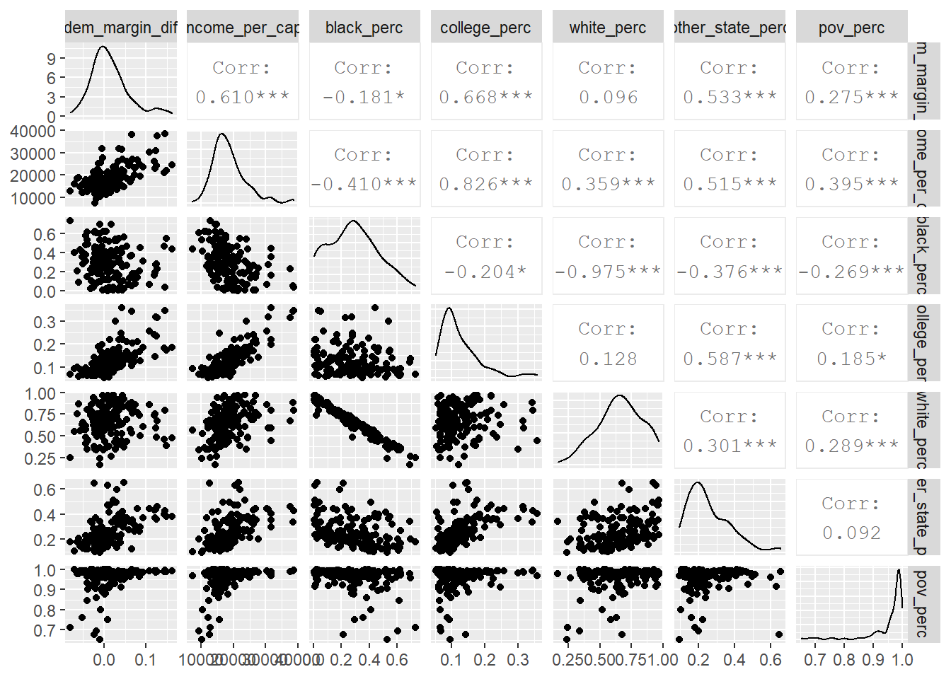
Thanks to the amazing GGally package we can quickly get summary plots and correlations for a ton of data. There’s not a ton here that’s new, but it is interesting to see that counties with high per-capita income, significant percentages of college graduates, and who moved from another state in the last year were correlated with Democrats’ shift relative to 2016. These variables are all related – it seems that many new Georgians are moving to college-educated, Democratic counties with high incomes (like DeKalb, Cobb, and Gwinnett).
ACS stats over time
One of my main questions is whether demographic trends, particularly in the Atlanta suburbs, might give some indication for whether these swing voters might be more solidly democratic, or if we can expect some combination of ticket-splitting and/or reversion to the (Republican) mean. So we can pull ACS data from 2014 in addition to 2019 to get a sense for how things are changing.
acs_time <- map_dfr(c(2014, 2019), ~ get_acs(geography = "county",
               variables = c(tot_pop = "B01003_001",
                             age_male = "B01002_002",
                             age_female = "B01002_003",
                             ba = "B15003_022",
                             ma = "B15003_023",
                             pd = "B15003_024",
                             phd = "B15003_025",
                             poverty = "B17001_001",
                             medicaid = "C27007_001",
                             tot_white = "B02001_002",
                             tot_black = "B02001_003",
                             tot_ai = "B02001_004",
                             tot_asian = "B02001_005",
                             born_other_state = "B06001_025",
                             income = "B19127_001"),
              year = .x) %>%
                  mutate(year = .x))

acs_time2 <- acs_time %>%
    clean_names() %>%
    unite(name_year, c(name, year), na.rm = TRUE, sep = ", ") %>%
    pivot_wider(names_from = variable, values_from = estimate, id_cols = name_year) %>%
    separate(name_year, into = c("county", "state", "year"), sep = ", ") %>%
    distinct() %>%
    left_join(fips_codes %>% select(-state) %>% unite(fips_code, c(state_code, county_code), sep = ""), by= c("state" = "state_name", "county")) %>%
    mutate(medicaid_perc = medicaid / tot_pop,
           pov_perc = poverty / tot_pop,
           college = ba + ma + pd + phd,
           college_perc = college / tot_pop,
           white_perc = tot_white / tot_pop,
           black_perc = tot_black / tot_pop,
           ai_perc = tot_ai / tot_pop,
           asian_perc = tot_asian / tot_pop,
           other_state_perc = born_other_state / tot_pop,
           income_per_cap = income / tot_pop,
           ga = if_else(state == "Georgia", "Georgia", "All other states")) %>%
    left_join(communities2)
The first plot below compares Georgia with other states according to six demographic variables, while the second chart looks only at Georgia’s Big Cities, Suburbs, and Exurbs:
## change over time plots
for_plot <- acs_time2 %>%
    select(county, state, year, ga, acp_county_type, college_perc, white_perc, black_perc,
           born_other_state, other_state_perc, income_per_cap) %>%
    mutate(ga = factor(ga, levels = c("All other states", "Georgia"))) %>%
    group_by(state, year) %>%
    summarize(college_perc = mean(college_perc, na.rm = TRUE),
              white_perc = mean(white_perc, na.rm = TRUE),
              black_perc = mean(black_perc, na.rm = TRUE),
              born_other_state = sum(born_other_state),
              other_state_perc = mean(other_state_perc, na.rm = TRUE),
              income_per_cap = mean(income_per_cap, na.rm = TRUE)) %>%
    pivot_longer(college_perc:income_per_cap)
## `summarise()` regrouping output by 'state' (override with `.groups` argument)for_plot %>%
ggplot(aes(year, value, group = state)) +
geom_point(aes(color = "#F8766D")) +
geom_point(data = for_plot %>% filter(state == "Georgia"), aes(color = "#00BFC4"),
size = 2.5) +
geom_line(aes(color = "#F8766D")) +
geom_line(data = for_plot %>% filter(state == "Georgia"), aes(color = "#00BFC4"),
size = 1.5) +
facet_wrap(~ name, scales = "free_y") +
theme(legend.position = "none") +
labs(y = "", x = "", title = "Georgia Demographic Change 2014-2019 vs. the US")## Warning: Removed 4 rows containing missing values (geom_point).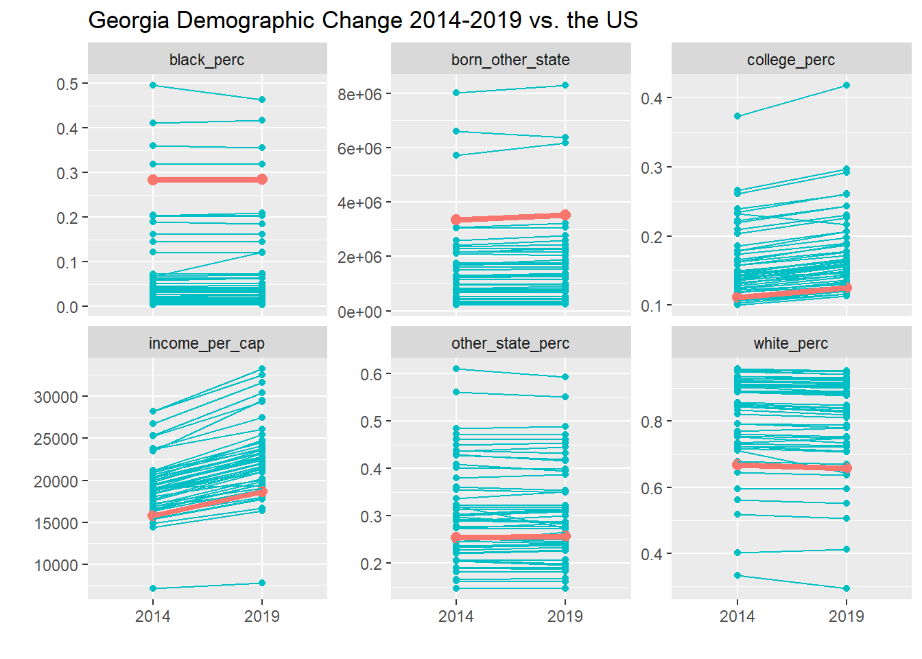
## GA change by county type
acs_time2 %>%
    select(county, state, year, ga, acp_county_type, college_perc, white_perc, black_perc,
           other_state_perc, income_per_cap) %>%
    filter(state == "Georgia",
           acp_county_type %in% c("Big Cities", "Exurbs", "Urban Suburbs")) %>%
    group_by(acp_county_type, year) %>%
    summarize(college_perc = mean(college_perc, na.rm = TRUE),
              white_perc = mean(white_perc, na.rm = TRUE),
              black_perc = mean(black_perc, na.rm = TRUE),
              other_state_perc = mean(other_state_perc, na.rm = TRUE),
              income_per_cap = mean(income_per_cap, na.rm = TRUE)) %>%
    pivot_longer(college_perc:other_state_perc) %>%
    drop_na(acp_county_type) %>%
    ggplot(aes(year, value, group = acp_county_type, color = acp_county_type)) +
    geom_point() +
    geom_line() +
    facet_wrap(~ name, scales = "free_y") +
    scale_y_continuous(labels = scales::percent_format(1L)) +
    labs(y = "", x = "", title = "Georgia Demographic 2014-2019 Change by County Type")
## `summarise()` regrouping output by 'acp_county_type' (override with `.groups` argument)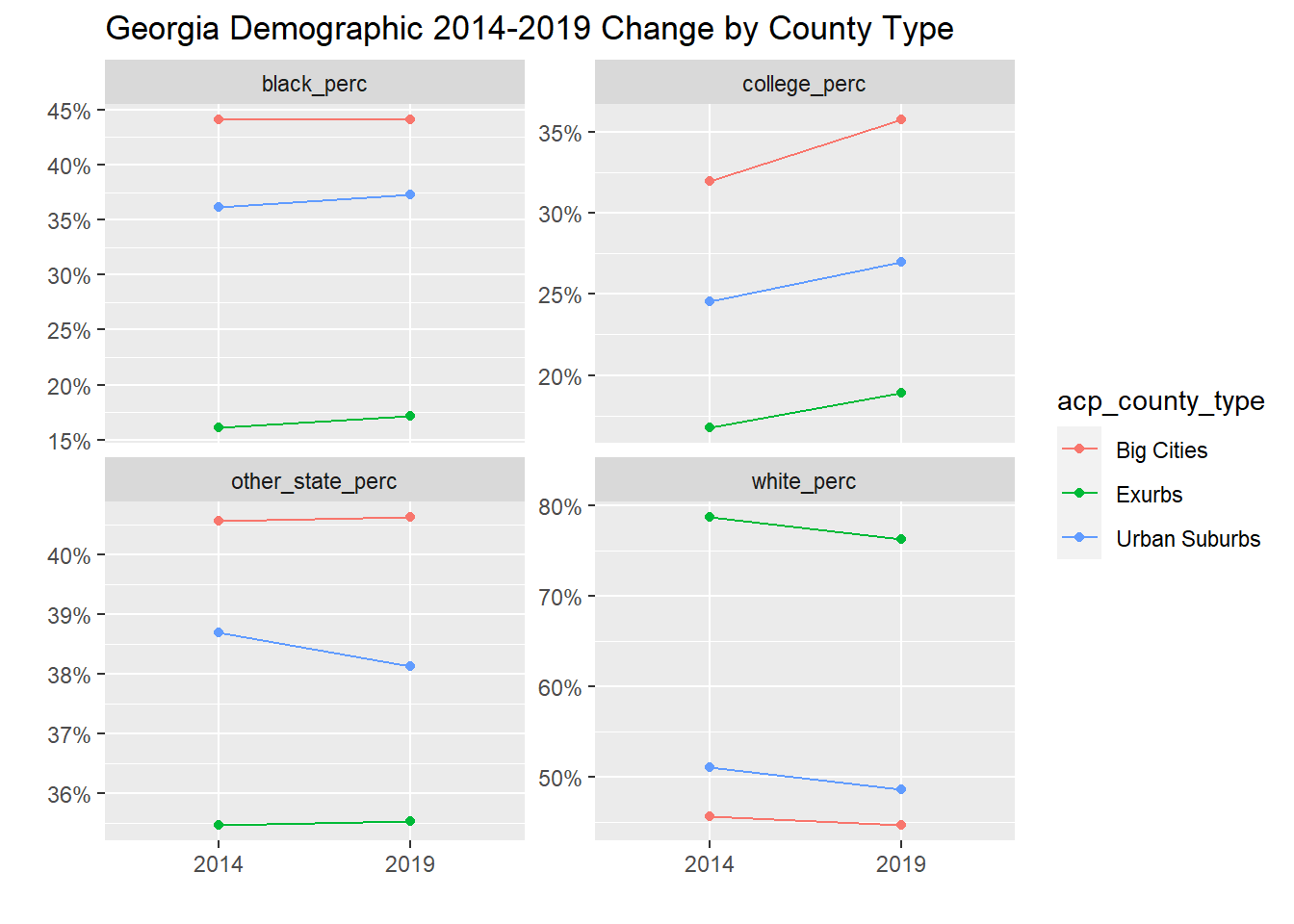
The first chart shows that Georgia counties have a substantial percentage of Black residents and residents born in another state, although these populations haven’t grown significantly in over the last five years. It has seen a marked increase in income per capita as well as in the percentage of college-educated adults (trends in line with the rest of the country). The second chart shows that many college-educated Georgians live in Big Cities, Exurbs, and Urban Suburbs, with increases in all three over the five year window.
Senate results vs pres
Next we can compare Ossoff and Warnock’s special election margins over Biden in Georgia. While late polls in Georgia indicated that Ossoff and Warnock might be favored by a few points (1.8-2.1 points), there was still a lot of uncertainty and apprehension among Georgia Democrats. Even while the Georgia polls were among the most accurate in Georgia of any state for the November election, many top-tier pollsters sat out the January Senate elections, and Democrats’ leads were still within the margin of error. Further, given that Biden ran ahead of both Warnock and Ossoff in November and that there was every reason to expect GOP voters to be highly motivated given Trump’s recent loss (both overall and in the state!), Democrats’ expectations were mostly held in check.
ossoff <- read_csv("C:\\Users\\ChadPeltier\\Downloads\\detailxls\\ossoff.csv") %>%
    row_to_names(row_number = 2) %>%
    clean_names() %>%
    rename_with(.cols = 2:7, .fn = ~paste0("perdue_", .x)) %>%
    rename_with(.cols = 8:12, .fn = ~paste0("ossoff_", .x)) %>%
    select(county, contains("total")) %>%
    mutate(across(2:4, as.numeric),
           ossoff_percent = ossoff_total_votes_2 / total,
           perdue_percent = perdue_total_votes / total,
           ossoff_margin = ossoff_percent - perdue_percent) %>%
    select(county, ossoff_percent, ossoff_margin)
## Warning: Missing column names filled in: 'X2' [2], 'X3' [3], 'X4' [4], 'X5' [5],
## 'X6' [6], 'X7' [7], 'X8' [8], 'X9' [9], 'X10' [10], 'X11' [11], 'X12' [12],
## 'X13' [13]## Warning in row_to_names(., row_number = 2): Row 2 does not provide unique names.
## Consider running clean_names() after row_to_names().warnock <- read_csv("C:\\Users\\ChadPeltier\\Downloads\\detailxls\\warnock.csv") %>%
row_to_names(row_number = 2) %>%
clean_names() %>%
rename_with(.cols = 2:7, .fn = ~paste0("loeffler_", .x))%>%
rename_with(.cols = 8:12, .fn = ~paste0("warnock_", .x)) %>%
select(county, contains("total")) %>%
mutate(across(2:4, as.numeric),
warnock_percent = warnock_total_votes_2 / total,
loeffler_percent = loeffler_total_votes / total,
warnock_margin = warnock_percent - loeffler_percent) %>%
select(county, warnock_percent, warnock_margin)## Warning: Missing column names filled in: 'X2' [2], 'X3' [3], 'X4' [4], 'X5' [5],
## 'X6' [6], 'X7' [7], 'X8' [8], 'X9' [9], 'X10' [10], 'X11' [11], 'X12' [12],
## 'X13' [13]
## Warning: Row 2 does not provide unique names. Consider running clean_names()
## after row_to_names().senate <- ossoff %>%
left_join(warnock)
ga_senate <- ga %>%
left_join(senate) %>%
mutate(ossoff_biden_margin = ossoff_percent - dem_perc20,
warnock_biden_margin = warnock_percent - dem_perc20)Nevertheless, the polls went 2/2 in Georgia for the 2020 election cycle.
## counties where ossoff / warnock outperformed Biden
ga_senate_sf <- acs_sf %>%
    left_join(ga_senate)
## Joining, by = "fips_code"p5 <- ga_senate_sf %>%
ggplot() +
geom_sf() +
geom_sf(aes(fill = ossoff_biden_margin)) +
theme_void() +
scale_fill_gradient2(low = "#ca0020", high = "#0571b0",
labels = scales::percent_format()) +
labs(title = "Ossoff Margin Over Biden (2021)") +
theme(legend.title = element_blank())
p6 <- ga_senate_sf %>%
ggplot() +
geom_sf() +
geom_sf(aes(fill = warnock_biden_margin)) +
theme_void() +
scale_fill_gradient2(low = "#ca0020", high = "#0571b0",
labels = scales::percent_format()) +
labs(title = "Warnock Margin Over Biden (2021)") +
theme(legend.title = element_blank())
p1 + p2 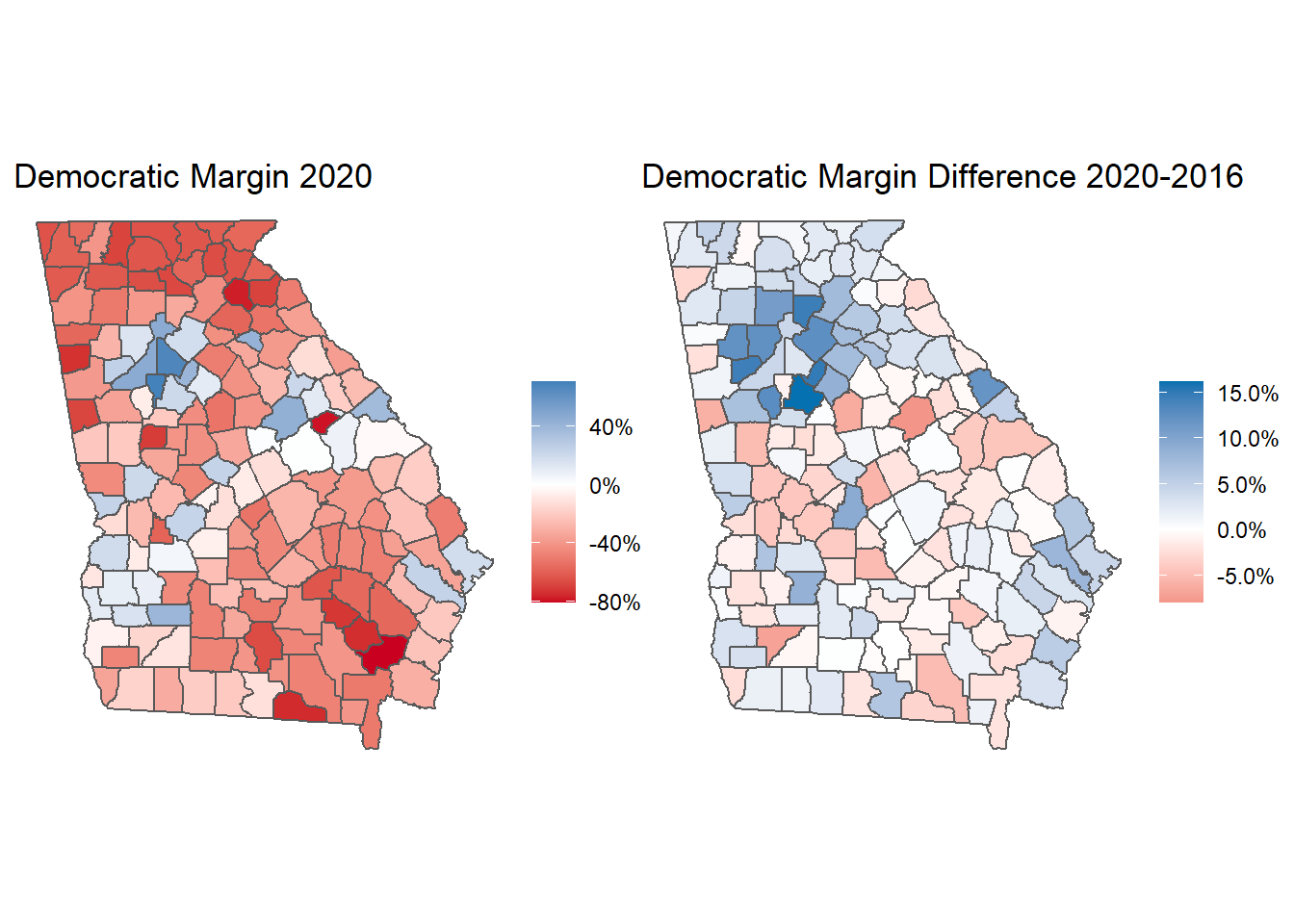
p5 + p6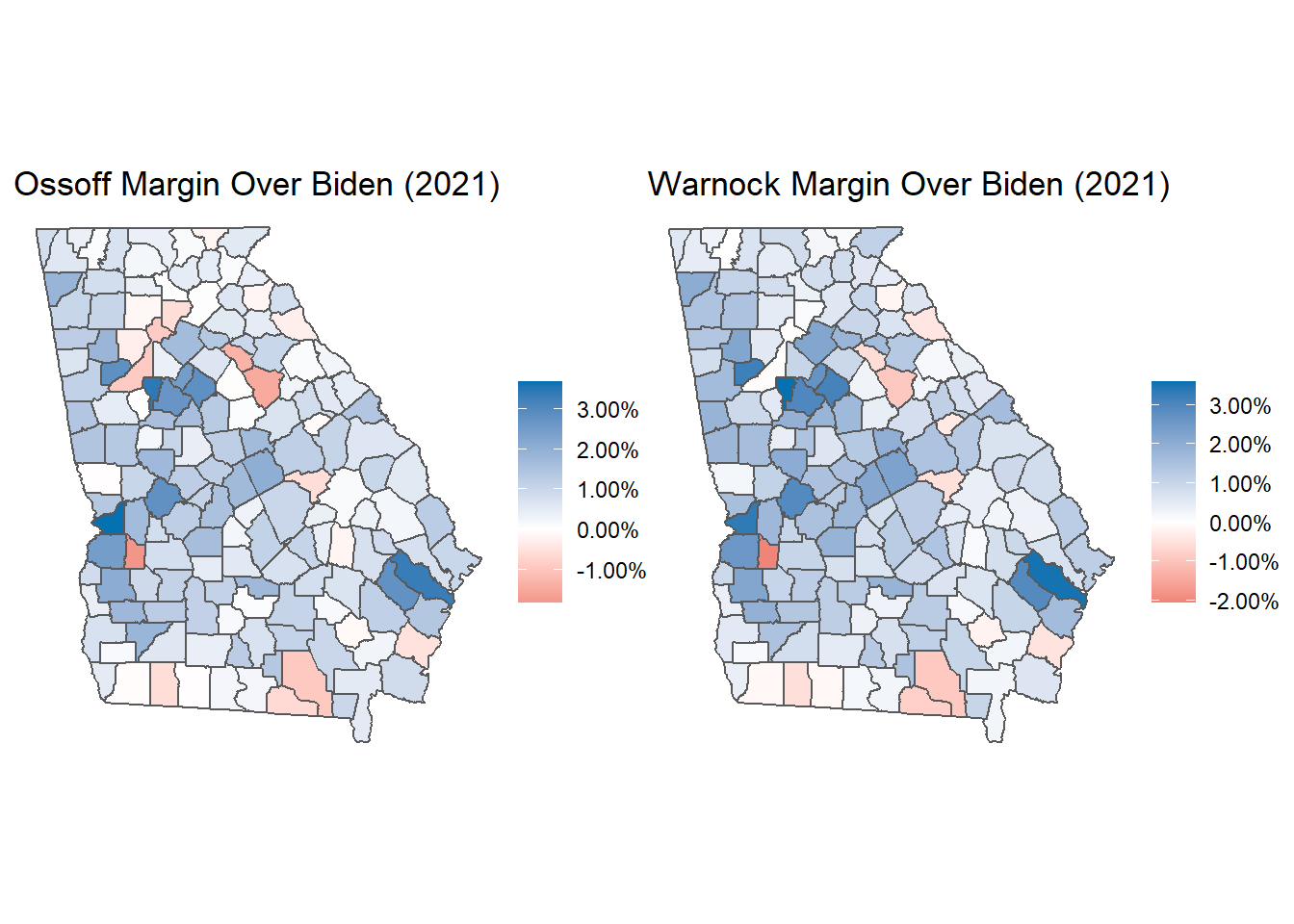
#ggsave("senate.png", width = 16/1.2, height = 9/1.2)Here we can really see the impact that south Atlanta counties has for Democrats in 2020. Clayton, Douglas, Newton, and Henry counties all voted for Warnock in January with 3% margins over their margins for Biden in November.
While there wasn’t a ton of ticket splitting in November, Warnock did outperform Ossoff in most counties across Georgia. There are various reasons for this that will take more detailed data to disentangle, but it is generally thought that Perdue, as a non-appointed incumbent, would outperform Loeffler, who also shifted heavily to the right in her wide-open primary where she had to defeat GOP representative Doug Collins (I think we have to acknowledge the likely role that sexism plays in Perdue’s margin, too). Also, some percentage of swing voters might like both Democratic candidates, but would rather the Democrats not take unified control of government.
## where warnock beat ossoff
ga_senate_sf %>%
    mutate(warnock_ossoff_margin = warnock_biden_margin - ossoff_biden_margin) %>%
    ggplot() +
    geom_sf() +
    geom_sf(aes(fill = warnock_ossoff_margin)) +
    theme_void() +
    scale_fill_gradient2(low = "#ca0020", high = "#0571b0",
                         labels = scales::percent_format()) +
    labs(title = "Warnock Margin Over Ossoff (2021)") +
    theme(legend.title = element_blank())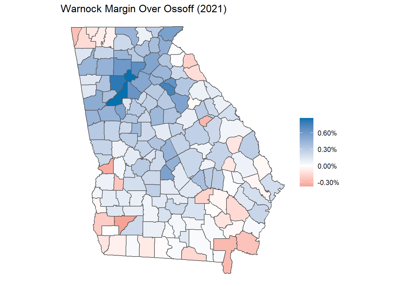
p7 <- ga_senate_sf %>%
    group_by(acp_county_type) %>%
    summarize(ossoff_biden_margin = mean(ossoff_biden_margin, na.rm = TRUE)) %>%
    drop_na() %>%
    ggplot(aes(ossoff_biden_margin, reorder(acp_county_type, ossoff_biden_margin),
               color = cut(ossoff_biden_margin, c(-Inf, -0.0025, 0.0025, Inf)))) +
    geom_point(size = 2) +
    geom_segment(aes(x = 0, xend = ossoff_biden_margin, y = acp_county_type, yend = acp_county_type), size = 1) +
    scale_x_continuous(labels = scales::percent_format()) +
    labs(y = "", x = "", title = "Ossoff 2021 Runoff Margin Over Biden") +
    scale_color_manual(values = c("(-Inf,-0.0025]" = "red",
                                  "(-0.0025,0.0025]" = "purple",
                                  "(0.0025, Inf]" = "royalblue")) +
    theme(legend.position = "none")
## `summarise()` ungrouping output (override with `.groups` argument)p8 <- ga_senate_sf %>%
group_by(acp_county_type) %>%
summarize(warnock_biden_margin = mean(warnock_biden_margin, na.rm = TRUE)) %>%
drop_na() %>%
ggplot(aes(warnock_biden_margin, reorder(acp_county_type, warnock_biden_margin),
color = cut(warnock_biden_margin, c(-Inf, -0.0025, 0.0025, Inf)))) +
geom_point(size = 2) +
geom_segment(aes(x = 0, xend = warnock_biden_margin, y = acp_county_type, yend = acp_county_type), size = 1) +
scale_x_continuous(labels = scales::percent_format()) +
labs(y = "", x = "", title = "Warnock 2021 Runoff Margin Over Biden") +
scale_color_manual(values = c("(-Inf,-0.0025]" = "red",
"(-0.0025,0.0025]" = "purple",
"(0.0025, Inf]" = "royalblue")) +
theme(legend.position = "none") ## `summarise()` ungrouping output (override with `.groups` argument)p7 + p8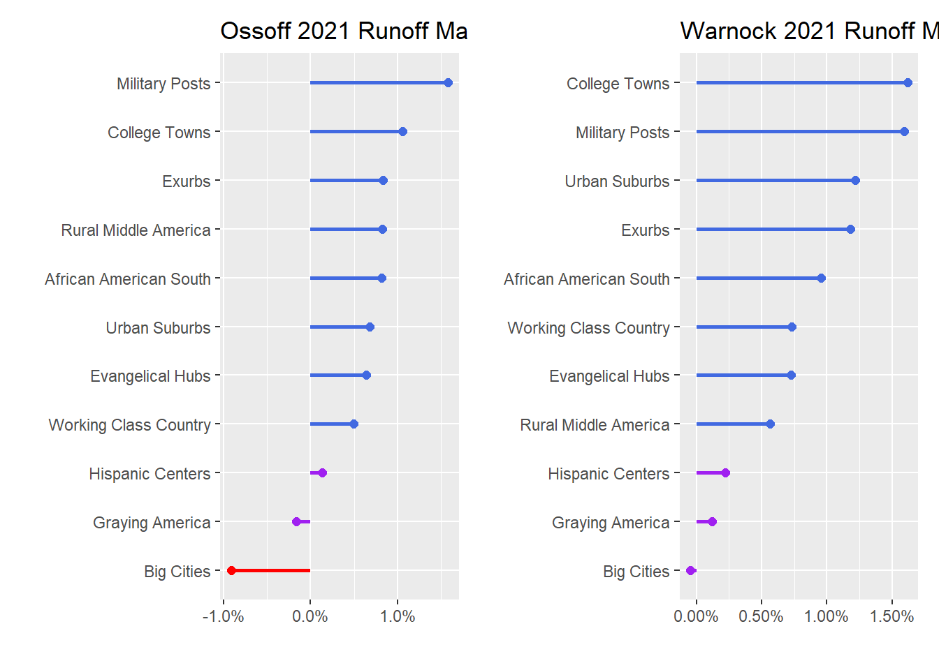
Interestingly, Warnock’s advantage relative to Ossoff was probably most critical in Atlanta itself, where Ossoff actually performed worse than Biden! Further, and importantly for Democrats moving forward, Ossoff and Warnock both outperformed Biden in the suburbs and exurbs.
Survey
Finally, while this data is interesting, it’s also at the county level and doesn’t give us a clear picture of how individual voters within those counties, with their unique combinations of demographic factors and political opinions, might actually feel about Democratic candidates and Democratic policies.
While Ossoff and Warnock’s margins over Biden in January and demographic shifts might suggest Democrats have a solid shot of holding on to Georgia in 2022 and 2024, actual polling data would be critical to understanding how much Democrats’ gains were limited to anti-Trump voters and not actual conversions.
The UCLA / Democracy Fund Nationscape data can give us at least a little more information here. I’ll read in data from the last month of surveys in June 2020, bind them, and then add some Bloomberg CityLab Congressional District data to classify districts on an urban-rural scale, similar to the process above for counties. Then I’ll make chart for three survey questions, with results aggregated by district type.
Note that thanks to the excellent srvyr package, I was able to incorporate the survey’s weights, which hopefully gives a more accurate picture of the actual US population – although it should be noted that 2020 polls still were affected by signficant non-respondent bias that mostly went Trump’s way, even after weighting for factors like education.
path <- "C:\\Users\\ChadPeltier\\Downloads\\Nationscape_phase2\\Nationscape-DataRelease_WeeklyMaterials_DTA\\phase_2_v20200814"

files <- tibble(files = list.files(path))

files <- files %>%
    mutate(files2 = paste0(path, "\\", files))

files2 <- map(files$files2, ~ list.files(.x, full.names = TRUE)) %>%
    enframe() %>%
    unnest(value) %>%
    mutate(value = str_replace(value, "\\/", "\\\\"),
           date = str_extract(value, "(?<=ns)\\d+"),
           date = ymd(date)) %>%
    filter(str_detect(value, "\\.dta$"),
           date > ymd("2020-06-01"))

nationscape <- map_dfr(files2$value, haven::read_dta)

## add citylab cdi data
cdi <- read_csv("https://raw.githubusercontent.com/theatlantic/citylab-data/master/citylab-congress/citylab_cdi.csv") %>%
    clean_names() %>%
    mutate(cd = str_remove(cd, "-"),
           cd = str_replace(cd, "AL", "00"))

## final cleaning, replacing 888s, dropping NAs for ID and weight, changing col types
nationscape2 <- nationscape %>%
    left_join(cdi %>% select(cd, cluster), by = c("congress_district" = "cd")) %>%
    mutate(across(everything(), as.character),
           across(everything(), ~ str_replace_all(., "888", NA_character_)),
           weight = as.numeric(weight),
           cluster = factor(cluster, levels = c("Pure rural", "Rural-suburban   mix",
                                                "Sparse suburban", "Dense suburban",
                                                "Urban-suburban mix", "Pure urban"))) %>%
    drop_na(response_id, weight)
First, the survey asked “Would you consider voting for Trump?” This question gives us a baseline for how different types of districts would vote.
## not_trump
nationscape2 %>%
    mutate(ga = if_else(state == "GA", 1, 0),
           consider_trump = case_when(consider_trump == 1 ~ "Yes",
                                      consider_trump == 2 ~ "No",
                                      consider_trump == 999 ~ "Don't know")) %>%
    filter(
           #cluster %in% c("Dense suburban", "Urban-suburban mix", "Sparse suburban"),
           !is.na(consider_trump)) %>%
    as_survey_design(weights = weight) %>%
    group_by(cluster, consider_trump) %>%
    summarize(mean = survey_mean()) %>%
    mutate(upper = mean + mean_se,
           lower = mean - mean_se,
           consider_trump = factor(consider_trump,
                                   levels = c("No", "Don't know", "Yes"))) %>%
    drop_na(cluster) %>%
    ggplot(aes(mean, cluster, color = consider_trump)) +
    geom_point() +
    geom_errorbar(aes(xmin = lower, xmax = upper), width = 0.2) +
    labs(y = "", x = "% of U.S.",
         title = "Would you consider voting for Trump?") +
    scale_x_continuous(labels = scales::percent) +
    theme(legend.title = element_blank())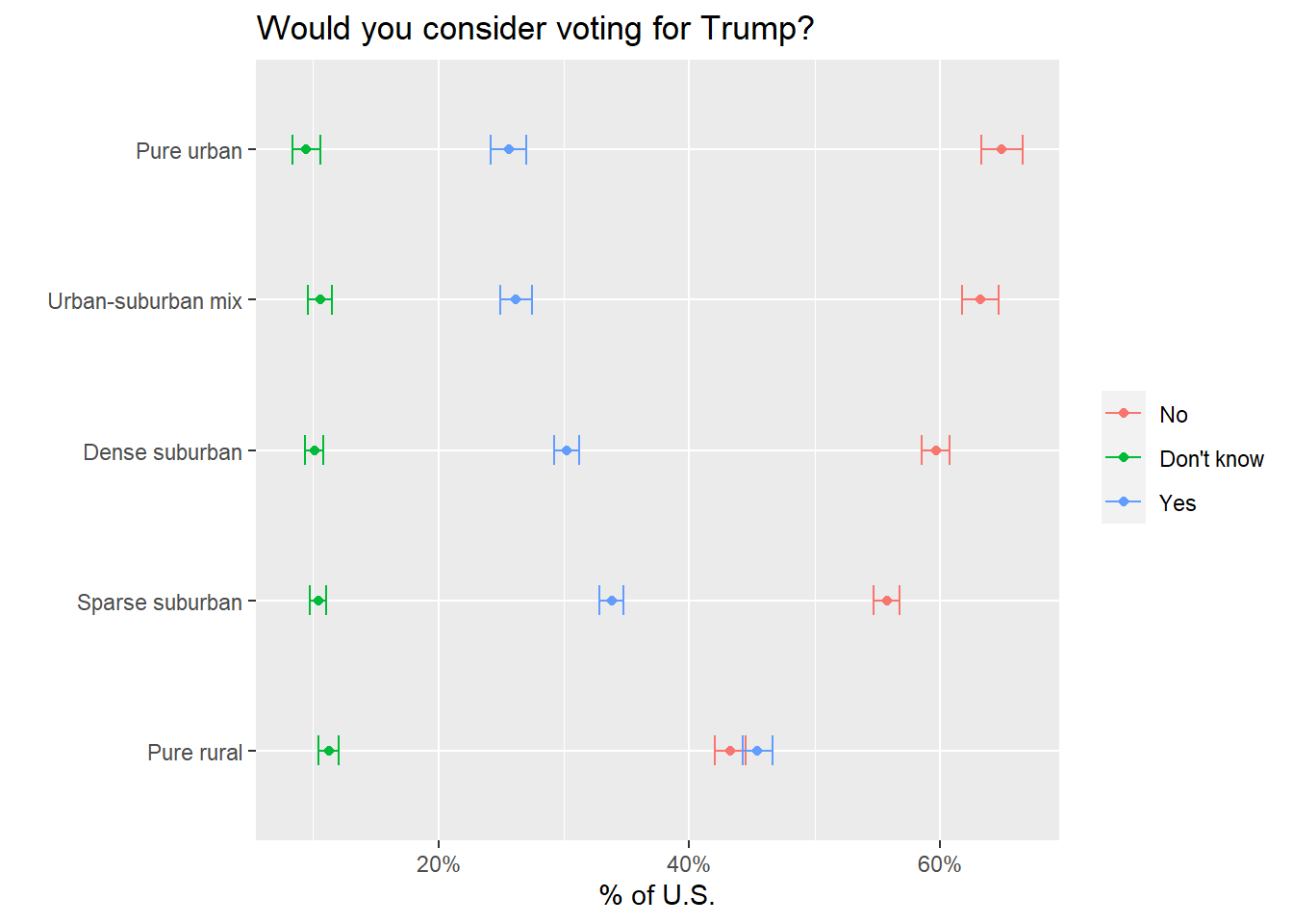
This is one of the clearest charts for demonstrating the geographic partisan divide in the US right now. As districts get more rural, the percentage of respondents who would consider voting for Trump increases.
nationscape2 %>%
    mutate(ga = if_else(state == "GA", 1, 0),
           group_favorability_democrats = case_when(group_favorability_democrats == 1 ~ "Very favorable",
                                      group_favorability_democrats == 2 ~ "Somewhat favorable",
                                      group_favorability_democrats == 999 ~ "Haven't heard enough",
                                      group_favorability_democrats == 3 ~ "Somewhat unfavorable",
                                      group_favorability_democrats == 4 ~ "Very unfavorable"),
           group_favorability_democrats = factor(
              group_favorability_democrats,
              levels = c("Very unfavorable", "Somewhat unfavorable", "Haven't heard enough",
                         "Somewhat favorable", "Very favorable"))) %>%
    filter(consider_trump %in% c(2, 999),
           !is.na(group_favorability_democrats)) %>%
    as_survey_design(weights = weight) %>%
    group_by(cluster, group_favorability_democrats) %>%
    summarize(mean = survey_mean()) %>%
    mutate(upper = mean + mean_se,
           lower = mean - mean_se) %>%
    drop_na(cluster) %>%
    ggplot(aes(mean, cluster, color = group_favorability_democrats)) +
    geom_point() +
    geom_errorbar(aes(xmin = lower, xmax = upper), width = 0.2) +
    labs(y = "", x = "% of U.S.",
         title = "How favorable is your impression of Democrats?",
         subtitle = "For individuals who don't know or would not consider voting for Trump") +
    scale_x_continuous(labels = scales::percent) +
    theme(legend.title = element_blank())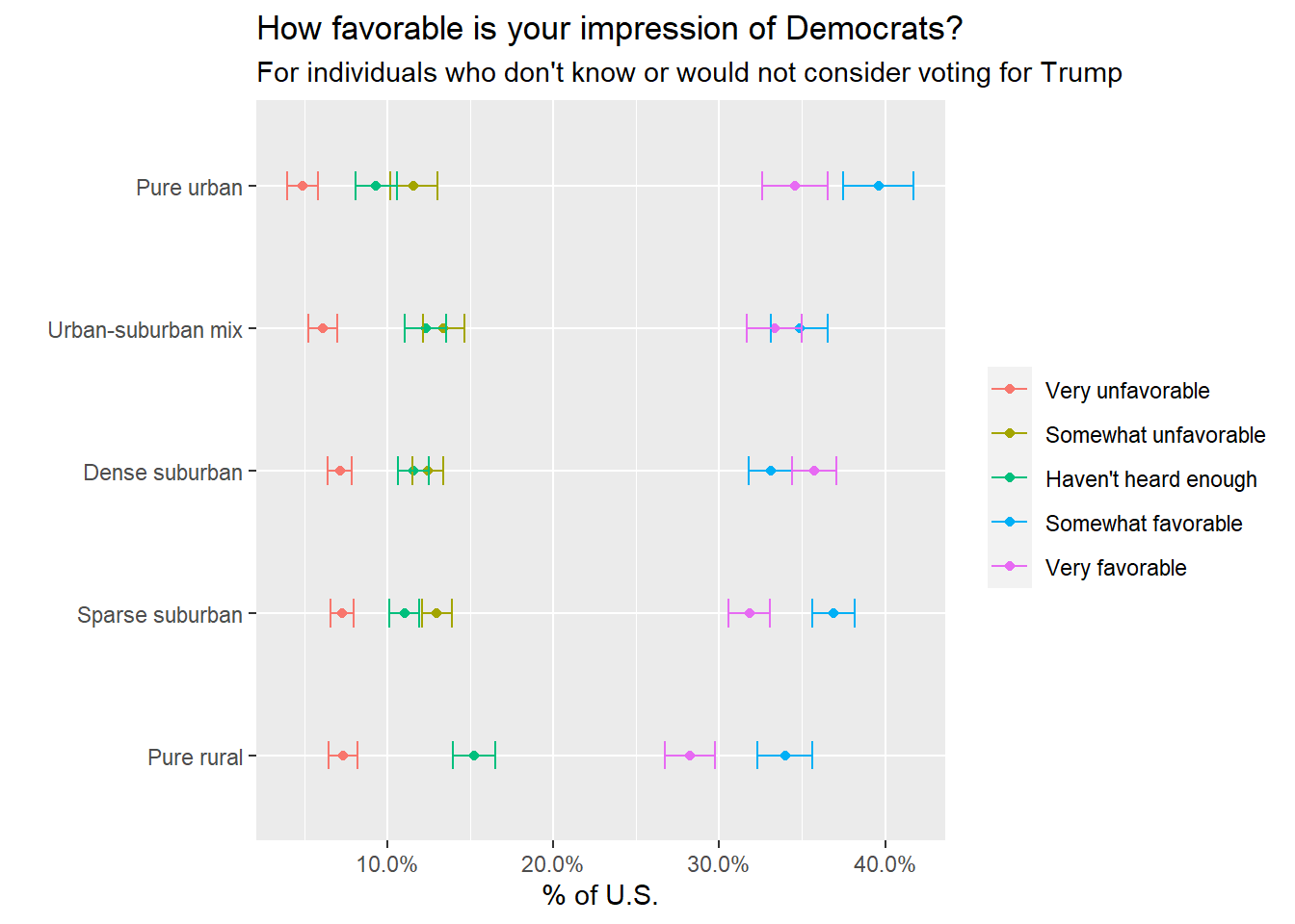
Next, the chart above looks at whether respondents who don’t know or definitely would not vote for Trump actually like Democrats. I was hoping this view might give some indication whether anti-Trump and swing voters are actually fans of Democrats themselves or just anti-Trump. This suggests that individuals who are anti-Trump are mostly still for Democrats, too. Across all district types, majorities (60-70%) of anti-Trump and undecided respondents have somewhat or very favorable opinions of Democrats.
nationscape2 %>%
    mutate(ga = if_else(state == "GA", 1, 0),
           public_option = case_when(public_option == 1 ~ "Agree",
                                     public_option == 999 ~ "Not sure",
                                     public_option == 2 ~ "Disagree"),
           public_option = factor(public_option, levels = c("Disagree", "Not sure", "Agree"))) %>%
    filter(consider_trump %in% c(2, 999),
           !is.na(public_option)) %>%
    as_survey_design(weights = weight) %>%
    group_by(cluster, public_option) %>%
    summarize(mean = survey_mean()) %>%
    mutate(upper = mean + mean_se,
           lower = mean - mean_se) %>%
    drop_na(cluster) %>%
    ggplot(aes(mean, cluster, color = public_option)) +
    geom_point() +
    geom_errorbar(aes(xmin = lower, xmax = upper), width = 0.2) +
    labs(y = "", x = "% of U.S.",
         title = "The government should provide a public option",
         subtitle = "For individuals who don't know or would not consider voting for Trump") +
    scale_x_continuous(labels = scales::percent) +
    theme(legend.title = element_blank())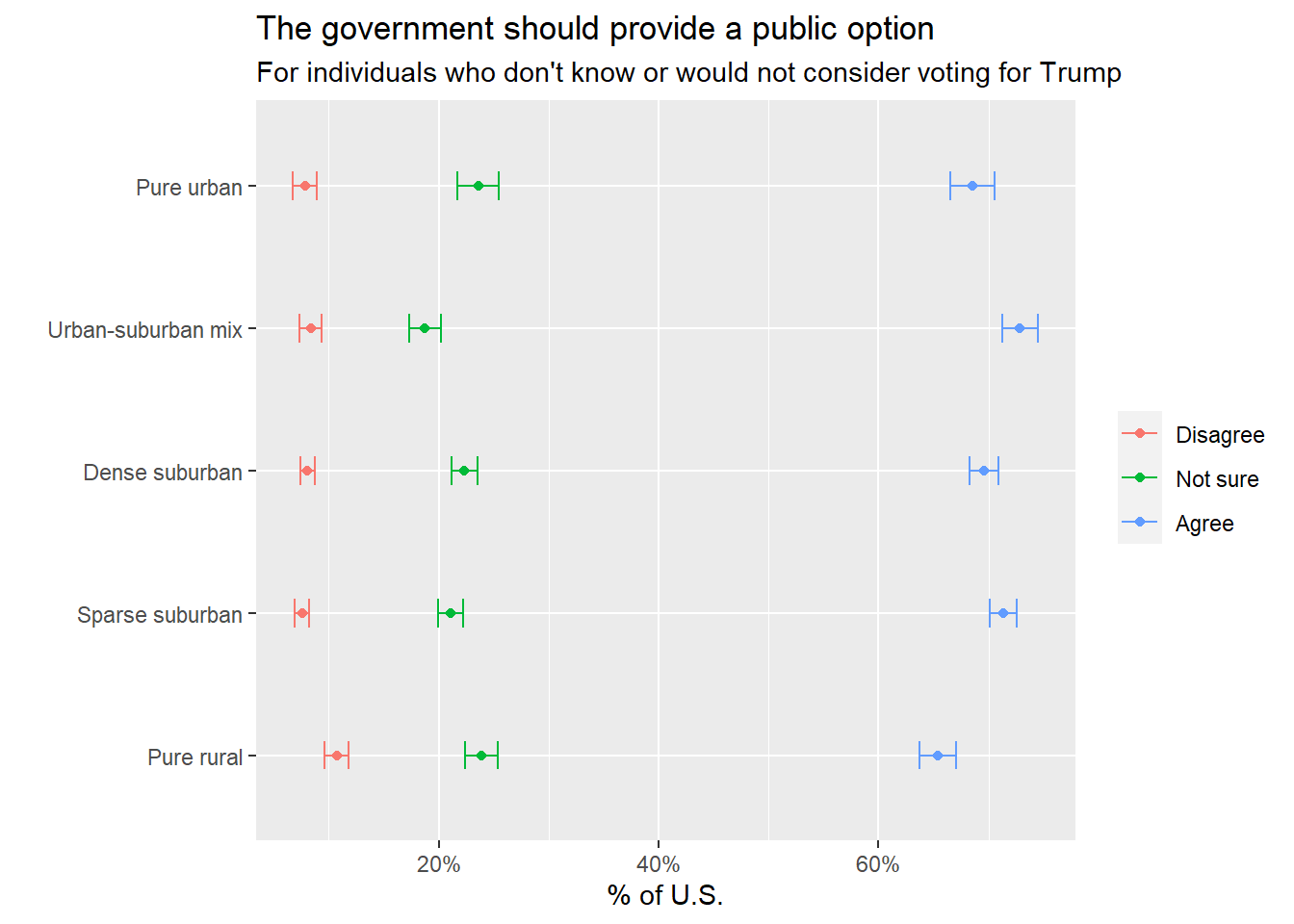
Finally, how do those same groups of voters feel about Democratic policies? Again, anti-Trump and undecided voters overwhelmingly like at least one major Democratic policy priority – a public option for health insurance. Majorities of these voters from every district type are in favor of a public option, with another 20% who aren’t sure.
Overall, while Democratic strategists in Georgia and around the country will work on this question for the next four years, there are decent reasons to expect Georgia to still be a blue-leaning state in 2022 and 2024.
Chad Peltier
My name is Chad Peltier and I the Head of Data & Integration for the US at Janes. I am interested in data science for social good, NLP, and GEOINT data.