Which Counties Have More Libraries
The Public Library Survey from the Institute of Museum and Library Services provides data on libraries across the county. Since my wife and I use the heck out of our library (shoutout to Palaces for the People!), I thought it would be interesting to see what data is correlated with more libraries and more funding for libraries around the country.
library(tidyverse)
library(tidycensus)
library(sf)
library(janitor)
library(GGally)

library(tidymodels)
library(usemodels)
library(tidyposterior)
Libraries data
The PLS data lists library branches, but individual libraries can have multiple locations. For example, my local library system, the Dekalb County Public Library, has 23 individual branches, but just one row in the dataset. These individual locations are divided between central and branch libraries, so I sum these together, then group by county to get the total number of library branches by county, as well as the total number of librarians and their salaries.
The PLS data’s county names are unfortunately a lot different than the other data I’m going to bring in, so I had to edit a number of county names manually using case_when below. However, I only edited names for counties with >5 library branches; otherwise I’d be manually changing > 40. Since this is just a first look, and there’s still a large number of counties with library data, we should still have a good amount of data for modeling.
# census_vars <- load_variables(2018, "acs5", cache = TRUE)

states <- tibble(state.abb, state.name, state.region) %>%
    rename(state = state.name)

## libraries
libraries <- read_csv("C:\\Users\\ChadPeltier\\Downloads\\pls_fy2018_data_files_csv\\pls_fy18_ae_pud18i.csv") %>%
    clean_names()

libraries2 <- libraries %>%
    mutate(tot_lib = centlib + branlib,
           reaplocale_add = as.numeric(reaplocale_add)) %>%
    unite(fips_code, c(incitsst, incitsco), sep = "") %>%
    group_by(cnty, fips_code, stabr) %>%
    summarize(tot_lib = sum(tot_lib),
              librarians = sum(libraria),
              salaries = sum(salaries),
              local_funding = sum(locgvt),
              tot_funding = sum(totincm),
              num_books = sum(bkvol),
              tot_visits = sum(visits),
              tot_programs = sum(totpro),
              urb_rural = round(mean(reaplocale_add, na.rm = TRUE), 0),
              ) %>%
    mutate(cnty = paste0(cnty, " County"),
           cnty = str_to_title(cnty),
           cnty = str_replace_all(cnty, "`", "\\'"),
           urb_rural = case_when(urb_rural == 1 ~ "Large city",
                                 urb_rural == 2 ~ "Midsize city",
                                 urb_rural == 3 ~ "Urban fringe large city",
                                 urb_rural == 4 ~ "Urban fringe mid city",
                                 urb_rural == 5 ~ "Large town",
                                 urb_rural == 6 ~ "Small town",
                                 urb_rural == 7 ~ "Rural outside MA",
                                 urb_rural == 8 ~ "Rural inside MA")
           ) %>%
    left_join(states, by = c("stabr" = "state.abb")) %>%
    mutate(state = if_else(cnty == "district of columbia", "district of columbia",
                                state)) %>%
    rename(county = cnty) %>%
    ungroup()
ACS Data
We’ll also bring in demographic county data from the Census Bureau’s American Community Survey using the amazing tidycensus package.
The idea here is to see if counties with large populations of certain demographic and other groups are underserved in terms of their library access – for example, do counties with large numbers of individuals on Medicaid have fewer libraries than counties with more residents not on Medicaid?
I have to do a good bit of wrangling to prep it for joining with the other data. I have to pivot_wider so that each ACS variable gets its own column, then re-join with the original dataframe. Then I’ll convert a lot of the raw ACS data into percentages of the total county population.
## acs
acs <- get_acs(geography = "county",
               variables = c(tot_pop = "B01003_001",
                             age_male = "B01002_002",
                             age_female = "B01002_003",
                             ba = "B15003_022",
                             ma = "B15003_023",
                             pd = "B15003_024",
                             phd = "B15003_025",
                             poverty = "B17001_001",
                             medicaid = "C27007_001",
                             tot_white = "B02001_002",
                             tot_black = "B02001_003",
                             tot_ai = "B02001_004",
                             tot_asian = "B02001_005"),
                year = 2018)

acs2 <- acs %>%
    clean_names() %>%
    pivot_wider(names_from = variable, values_from = estimate, id_cols = name) %>%
    left_join(acs %>%
                  clean_names() %>%
                  separate(name, into = c("county", "state"),
                           sep = ", ", remove = FALSE) %>%
                  select(name, county, state)) %>%
    relocate(state, county) %>%
    distinct() %>%
    left_join(fips_codes %>% select(-state) %>% unite(fips_code, c(state_code, county_code), sep = ""), by= c("state" = "state_name", "county")) %>%
    mutate(
           #county = str_replace(county, "Parish", "County"),
           #county = str_remove(county, " census area"),
           #county = str_to_lower(county),
           medicaid_perc = medicaid / tot_pop,
           pov_perc = poverty / tot_pop,
           college = ba + ma + pd + phd,
           college_perc = college / tot_pop,
           white_perc = tot_white / tot_pop,
           black_perc = tot_black / tot_pop,
           ai_perc = tot_ai / tot_pop,
           asian_perc = tot_asian / tot_pop)
Election data
Next we’ll bring in some election data for the last two presidential elections to see if counties with more people who voted for Trump or Clinton/Biden have more libraries.
We’ll also be able to see if counties with higher turnout have more libraries. This would be my guess, since a lot of the analysis of the 2020 polling error focused on the potential non-response of less civically-engaged citizens who then broke for Trump (particularly in places like Wisconsin). Since libraries are centers of civic and social infrastructure, maybe low-library counties were also more likely to be both low-turnout and/or Trump counties? From Nate Cohn at the New York Times’ Upshot:
A related possibility: During his term, Mr. Trump might have made gains among the kinds of voters who would be less likely to respond to surveys, and might have lost additional ground among voters who would be more likely to respond to surveys. College education, of course, is only a proxy for the traits that predict whether someone might back Mr. Trump or respond to a poll. There are other proxies as well, like whether you trust your neighbor; volunteer your time; are politically engaged.
Another proxy is turnout: People who vote are likelier to take political surveys. The Times/Siena surveys go to great lengths to reach nonvoters, which was a major reason our surveys were more favorable for the president than others in 2016. In 2020, the nonvoters reached by The Times were generally more favorable for Mr. Biden than those with a track record of turning out in recent elections. It’s possible that, in the end, the final data will suggest that Mr. Trump did a better job of turning out nonvoters who backed him. But it’s also possible that we reached the wrong low-turnout voters.
pres20 <- read_csv("https://github.com/tonmcg/US_County_Level_Election_Results_08-20/raw/master/2020_US_County_Level_Presidential_Results.csv") %>%
    mutate(election = 2020) %>%
    left_join(states, by = c("state_name" = "state")) %>%
    rename(fips_code = county_fips, county = county_name, state_abbr = state.abb, state = state_name)
##
## -- Column specification --------------------------------------------------------
## cols(
## state_name = col_character(),
## county_fips = col_character(),
## county_name = col_character(),
## votes_gop = col_double(),
## votes_dem = col_double(),
## total_votes = col_double(),
## diff = col_double(),
## per_gop = col_double(),
## per_dem = col_double(),
## per_point_diff = col_double()
## )pres16 <- read_csv("https://github.com/tonmcg/US_County_Level_Election_Results_08-20/raw/master/2016_US_County_Level_Presidential_Results.csv") %>%
left_join(states, by = c("state_abbr" = "state.abb")) %>%
rename(county = county_name) %>%
mutate(per_point_diff = parse_number(per_point_diff),
per_point_diff = per_point_diff / 100,
election = 2016,
state = if_else(county == "District of Columbia",
"District of Columbia", state),
fips_code = if_else(str_length(combined_fips) == 4,
paste0(0, combined_fips),
as.character(combined_fips))) %>%
select(-c(X1, combined_fips)) %>%
distinct()## Warning: Missing column names filled in: 'X1' [1]##
## -- Column specification --------------------------------------------------------
## cols(
## X1 = col_double(),
## votes_dem = col_double(),
## votes_gop = col_double(),
## total_votes = col_double(),
## per_dem = col_double(),
## per_gop = col_double(),
## diff = col_number(),
## per_point_diff = col_character(),
## state_abbr = col_character(),
## county_name = col_character(),
## combined_fips = col_double()
## )pres <- pres20 %>%
bind_rows(pres16) %>%
mutate(election = paste0("dem_perc", election),
state_county = paste(state, county, sep = "_")) %>%
pivot_wider(names_from = election, values_from = c(per_dem, total_votes), id_cols = fips_code) %>%
left_join(pres20 %>% select(state, county, fips_code)) %>%
rename(total_votes20 = 4, total_votes16 = 5,
dem_perc20 = 2, dem_perc16 = 3) %>%
mutate(dem_dif = dem_perc20 - dem_perc16,
total_votes_dif = total_votes20 - total_votes16,
#county = str_replace(county, "Parish", "County"),
#county = str_to_lower(county)
) %>%
relocate(state, county)## Joining, by = "fips_code"Finally, we’ll also add in some data from the American Communities Project that classifies counties based on various demographic variables into groups like “exurbs”, “working class country”, and “military posts”.
communities <- readxl::read_xlsx("C:\\Users\\ChadPeltier\\Downloads\\County-Type-Share.xlsx") %>%
    clean_names()
## New names:
## * `Type Number` -> `Type Number...2`
## * `Type Number` -> `Type Number...4`
## * `` -> ...5communities_key <- communities %>%
slice_head(n = 15) %>%
select(key, new_names)
communities2 <- communities %>%
left_join(communities_key, by = c("type_number_2" = "key")) %>%
rename(acp_county_type = new_names.y, fips_code = fips) %>%
select(3,8) %>%
mutate(fips_code = if_else(str_length(fips_code) == 4, paste0(0, fips_code),
as.character(fips_code)),
fips_code = as.character(fips_code))Finally, we can combine all of these dataframes together:
combined <- pres %>%
    left_join(acs2 %>% select(-c(state, county)), by = "fips_code") %>%
    left_join(libraries2 %>% select(-c(state, county)), by = "fips_code") %>%
    left_join(communities2) %>%
    mutate(turnout20 = total_votes20 / tot_pop,
           turnout16 = total_votes16 / tot_pop,
           turnout_dif = turnout20 - turnout16) %>%
    rename(state_abbr = stabr, region = state.region) %>%
    filter(!state %in% c("Hawaii", "Alaska")) %>%
    relocate(name, county, state, state_abbr, region, urb_rural, acp_county_type)
## Joining, by = "fips_code"## comparison of predictors vs. DV
combined %>%
drop_na() %>%
ggpairs(aes(color = region), progress = FALSE,
columns = c("tot_lib", "pov_perc", "college_perc", "tot_pop",
"black_perc", "dem_perc20", "turnout20"))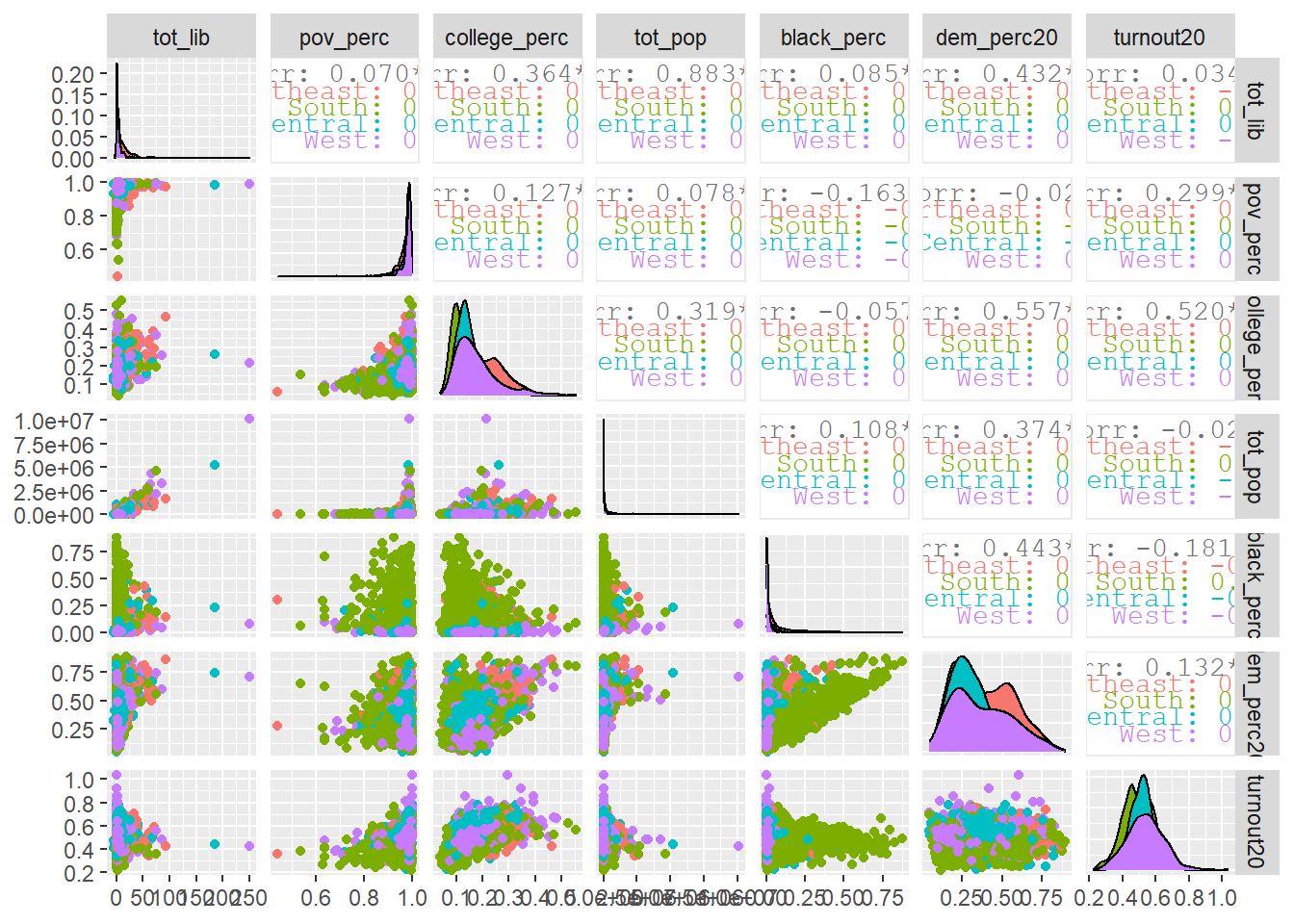
## comparison of library vars
combined %>%
    drop_na() %>%
    ggpairs(aes(color = region), progress = FALSE,
            columns = c("tot_lib", "salaries", "local_funding", "num_books",
                        "tot_visits", "tot_programs"))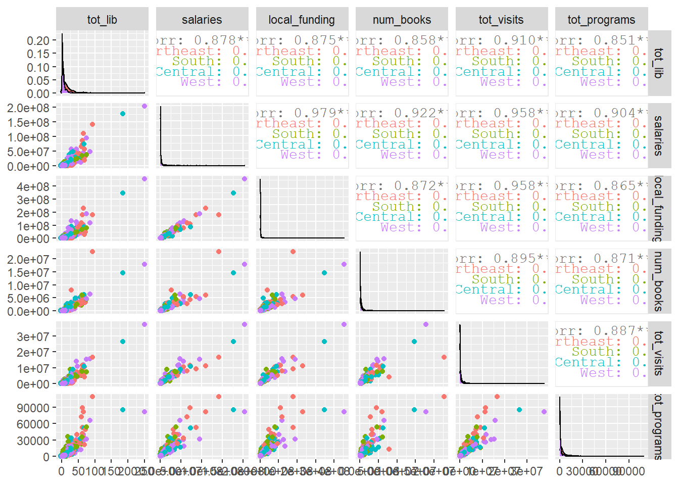
Modeling the Number of Libraries per County
So now we’ll try and build a model to predict the number of library branches in a county. We’ll take a subset of columns, then use tidymodels to split the training and testing data.
## Select cols (DV == total libraries)
combined_raw <- combined %>%
    ungroup() %>%
    drop_na() %>%
    select(name, tot_lib, age_male, age_female, medicaid_perc, tot_pop,
           pov_perc, college_perc, white_perc, black_perc, ai_perc, asian_perc,
           dem_perc20, dem_perc16, turnout20)

## split training/testing
lib_split <- initial_split(combined_raw)
lib_training <- training(lib_split)
lib_testing <- testing(lib_split)
lib_folds <- vfold_cv(lib_training)
We’ll start out with a basic regularized linear regression.
## Glmnet model
glmnet_recipe <- recipe(formula = tot_lib ~ ., data = lib_training) %>%
  update_role(name, new_role = "id") %>%
  step_zv(all_predictors()) %>%
  step_normalize(all_predictors())

glmnet_spec <- linear_reg(penalty = tune(), mixture = tune()) %>%
  set_mode("regression") %>%
  set_engine("glmnet")

glmnet_workflow <- workflow() %>%
  add_recipe(glmnet_recipe) %>%
  add_model(glmnet_spec)

glmnet_grid <- tidyr::crossing(penalty = 10^seq(-6, -1, length.out = 20),
                               mixture = c(0.05, 0.2, 0.4, 0.6, 0.8, 1))

all_cores <- parallel::detectCores(logical = FALSE)
cl <- parallel::makePSOCKcluster(all_cores)
doParallel::registerDoParallel(cl)
set.seed(1234)

glmnet_tune <- tune_grid(glmnet_workflow,
                         resamples = lib_folds,
                         grid = glmnet_grid)

show_best(glmnet_tune)
## Warning: No value of `metric` was given; metric 'rmse' will be used.## # A tibble: 5 x 8
## penalty mixture .metric .estimator mean n std_err .config
## <dbl> <dbl> <chr> <chr> <dbl> <int> <dbl> <chr>
## 1 0.0298 0.05 rmse standard 4.56 10 0.268 Preprocessor1_Model~
## 2 0.000001 0.05 rmse standard 4.56 10 0.268 Preprocessor1_Model~
## 3 0.00000183 0.05 rmse standard 4.56 10 0.268 Preprocessor1_Model~
## 4 0.00000336 0.05 rmse standard 4.56 10 0.268 Preprocessor1_Model~
## 5 0.00000616 0.05 rmse standard 4.56 10 0.268 Preprocessor1_Model~autoplot(glmnet_tune)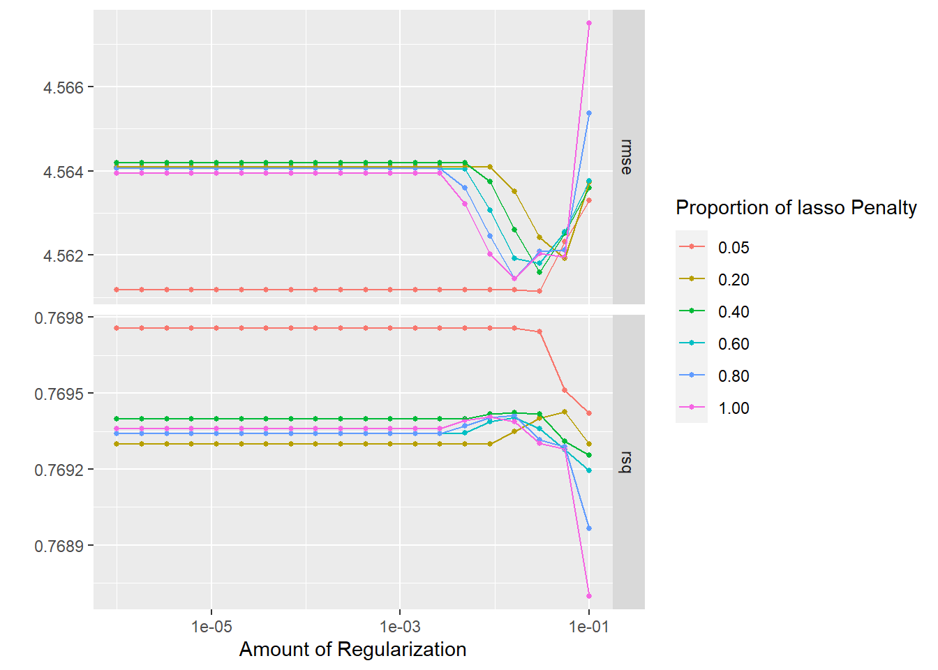
Pretty good! The R-squared values are all at around 75%. Ideally it’d be nice to have a RMSE of less than 4.5, but still a solid performance for a first model.
Next we’ll try an xgboost, tuning everything under the sun:
xgboost_spec <- boost_tree(trees = tune(), min_n = tune(), tree_depth = tune(),
                           learn_rate = tune(), loss_reduction = tune(),
                           sample_size = tune()) %>%
    set_mode("regression") %>%
    set_engine("xgboost")

xgboost_workflow <- workflow() %>%
    add_recipe(glmnet_recipe) %>%
    add_model(xgboost_spec)

all_cores <- parallel::detectCores(logical = FALSE)
cl <- parallel::makePSOCKcluster(all_cores)
doParallel::registerDoParallel(cl)
set.seed(1234)

xgboost_tune <- tune_grid(xgboost_workflow,
                          resamples = lib_folds,
                          grid = 15)

## Evaluate results
show_best(xgboost_tune)
## Warning: No value of `metric` was given; metric 'rmse' will be used.## # A tibble: 5 x 12
## trees min_n tree_depth learn_rate loss_reduction sample_size .metric
## <int> <int> <int> <dbl> <dbl> <dbl> <chr>
## 1 1592 10 5 0.0212 0.00000000469 0.607 rmse
## 2 1760 25 14 0.0389 0.000234 0.795 rmse
## 3 88 38 10 0.00400 0.00000000160 0.365 rmse
## 4 560 6 6 0.000407 0.0100 0.318 rmse
## 5 1935 18 7 0.0000127 0.00243 0.661 rmse
## # ... with 5 more variables: .estimator <chr>, mean <dbl>, n <int>,
## # std_err <dbl>, .config <chr>autoplot(xgboost_tune)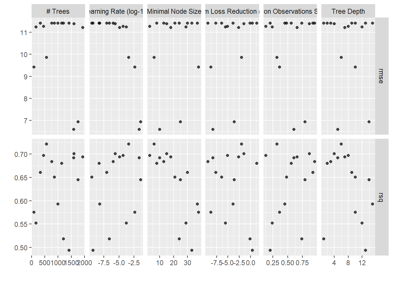
HMMMMMM. Not awesome! The glmnet models outperformed the xgboost pretty significantly! For our third model we’ll try a tuned MARS:
earth_spec <- mars(num_terms = tune(), prod_degree = tune(), prune_method = "none") %>%
    set_mode("regression") %>%
    set_engine("earth")

earth_workflow <- workflow() %>%
    add_recipe(glmnet_recipe) %>%
    add_model(earth_spec)

earth_grid <- tidyr::crossing(num_terms = 2 * (1:6),
                              prod_degree = 1:2)


all_cores <- parallel::detectCores(logical = FALSE)
cl <- parallel::makePSOCKcluster(all_cores)
doParallel::registerDoParallel(cl)
set.seed(1234)

earth_tune <- tune_grid(earth_workflow,
                        resamples = lib_folds,
                        grid = earth_grid)

## Evaluate results
show_best(earth_tune)
## Warning: No value of `metric` was given; metric 'rmse' will be used.## # A tibble: 5 x 8
## num_terms prod_degree .metric .estimator mean n std_err .config
## <dbl> <int> <chr> <chr> <dbl> <int> <dbl> <chr>
## 1 8 2 rmse standard 4.45 10 0.146 Preprocessor1_Mo~
## 2 10 1 rmse standard 4.50 10 0.267 Preprocessor1_Mo~
## 3 12 1 rmse standard 4.52 10 0.268 Preprocessor1_Mo~
## 4 8 1 rmse standard 4.54 10 0.267 Preprocessor1_Mo~
## 5 12 2 rmse standard 4.55 10 0.176 Preprocessor1_Mo~autoplot(earth_tune)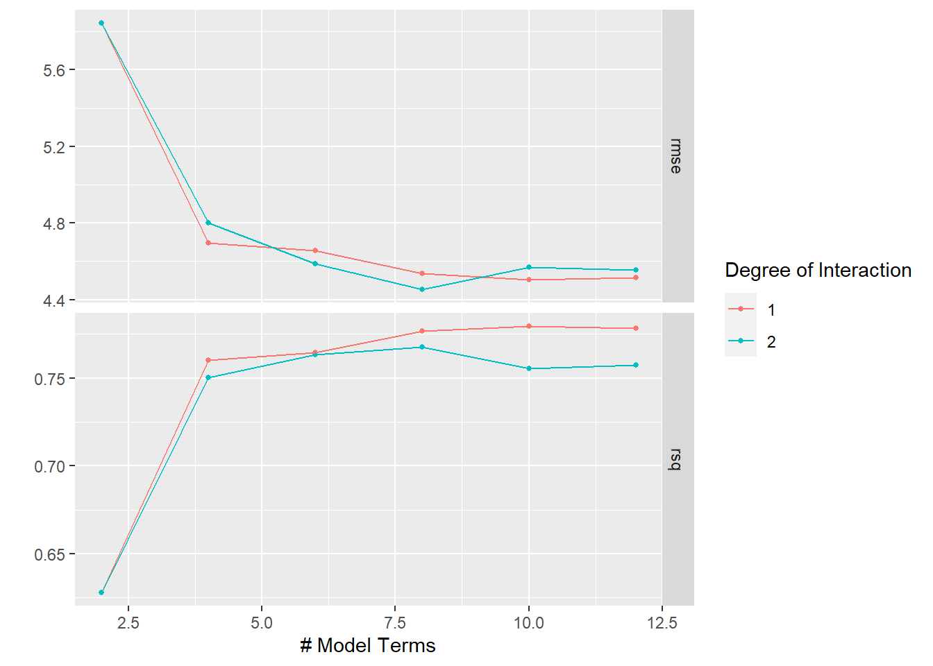
So, pretty comparable to the glmnet model.
Finally, I wrote out a single-layer keras model, but my computer couldn’t run it in <12 hours, so I didn’t actually let this model finish to compare with the others! Maybe if I can get some time on a cloud GPU instance, I’ll re-run!
mlp_rec <- recipe(tot_lib ~ ., data = lib_training) %>%
    update_role(name, new_role = "id") %>%
    step_YeoJohnson(all_predictors()) %>%
    step_normalize(all_predictors()) %>%
    step_normalize(all_predictors())

mlp_spec <- mlp(hidden_units = tune(),
                penalty = tune(),
                epochs = tune()) %>%
   set_engine("keras", trace = 0) %>%
   set_mode("regression")

mlp_wflow <- workflow() %>%
    add_model(mlp_spec) %>%
    add_recipe(mlp_rec)

mlp_param <- mlp_wflow %>%
    parameters() %>%
    grid_latin_hypercube(size = 15)

all_cores <- parallel::detectCores(logical = FALSE)
cl <- parallel::makePSOCKcluster(all_cores)
doParallel::registerDoParallel(cl)
set.seed(1234)

set.seed(99)
mlp_reg_tune <- tune_grid(mlp_wflow,
                          resamples = lib_folds,
                          grid = mlp_param)
Comparing Resamples with Tidyposterior
Now I thought it’d be cool to try out the tidyposterior package to fit Bayesian models to compare the resampled models’ r-squared estimates. Note that I use a relatively low number of iterations since this is just a first cut and it already takes a super long time to run on my machine.
## collect rsq estimates
glm_rsq <- collect_metrics(glmnet_tune, summarize = FALSE) %>%
    filter(.metric == "rsq") %>%
    select(id, "glmnet" = .estimate)

earth_rsq <- collect_metrics(earth_tune, summarize = FALSE) %>%
  filter(.metric == "rsq") %>%
  select(id, earth = .estimate)

rsq_estimates <- inner_join(glm_rsq, earth_rsq, by = "id")

lib_models <- lib_folds %>%
    left_join(rsq_estimates)


## Tidyposterior
all_cores <- parallel::detectCores(logical = FALSE)
cl <- parallel::makePSOCKcluster(all_cores)
doParallel::registerDoParallel(cl)
set.seed(1234)

rsq_anova <- perf_mod(lib_models,
                      prior_intercept = rstanarm::student_t(df = 1),
                      chains = 4,
                      iter = 1000,
                      seed = 2)

model_post <- rsq_anova %>%
    tidy(seed = 35) %>%
    as_tibble()
model_post %>%
mutate(model = fct_inorder(model)) %>%
ggplot(aes(x = posterior)) +
geom_histogram(bins = 50, col = "white", fill = "blue", alpha = 0.4) +
facet_wrap(~ model, ncol = 1) +
labs(x = expression(paste("Posterior for mean ", R^2)))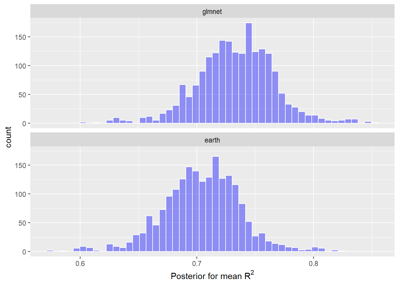
The glmnet and MARS models were extremely similar, but the distribution of posterior mean R-squared is slightly to the right for the most simple model – the glmnet.
Finalize Model
final_wf <- glmnet_workflow %>%
    finalize_workflow(select_best(glmnet_tune, "rmse"))

## variable importance
final_wf %>%
    fit(lib_training) %>%
    pull_workflow_fit() %>%
    vip::vi(lambda = select_best(glmnet_tune, "rmse")) %>%
    mutate(Importance = abs(Importance),
           Variable = fct_reorder(Variable, Importance)) %>%
    ggplot(aes(Importance, Variable, color = Sign)) +
    geom_point() +
geom_segment(aes(x = 0, xend = Importance, y = Variable, yend = Variable)) 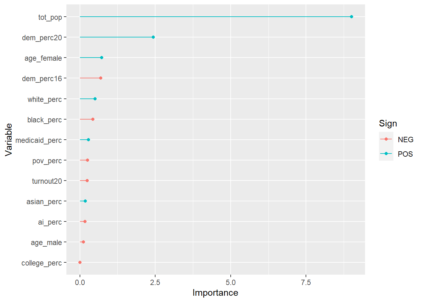
So the county’s total population explains most of the variation, like you’d expect: more people means more libraries. But there are some smaller effects from having a more Democratic county, a whiter county, and a county with older female residents.
Overall I’d say it’s hard to disentangle a number of related variables here. The urban-rural divide between Democrats and Republicans only intensified in 2020, and so naturally these more populous counties are more likely to have more libraries. But note that total population alone doesn’t explain the entire variation – having more Democrats explains part of it, too (I wonder if recently-Democratic suburbs, with lower total populations, has something to do with that?).
## testing data
final_results <- last_fit(final_wf, lib_split)

collect_metrics(final_results)
## # A tibble: 2 x 4
## .metric .estimator .estimate .config
## <chr> <chr> <dbl> <chr>
## 1 rmse standard 4.57 Preprocessor1_Model1
## 2 rsq standard 0.704 Preprocessor1_Model1The RMSE for the testing data is a little worse than for the training data, and the R-squared is noticeably lower, indicating some overfitting. The RMSE, which is what we optimized for our tuning parameters, is close enough to the training results that I’m not too worried, though.
## actual vs. predicted number of libraries (test data)
final_results %>%
    collect_predictions() %>%
    ggplot(aes(tot_lib, .pred)) +
    geom_abline(lty = 2, color = "gray50") +
    geom_point(aes(alpha = 0.5, color = "firebrick")) +
    labs(title = "Actual vs. Predicted Number of Libraries",
         subtitle = "Per county, from testing data") +
    theme(legend.position = "none")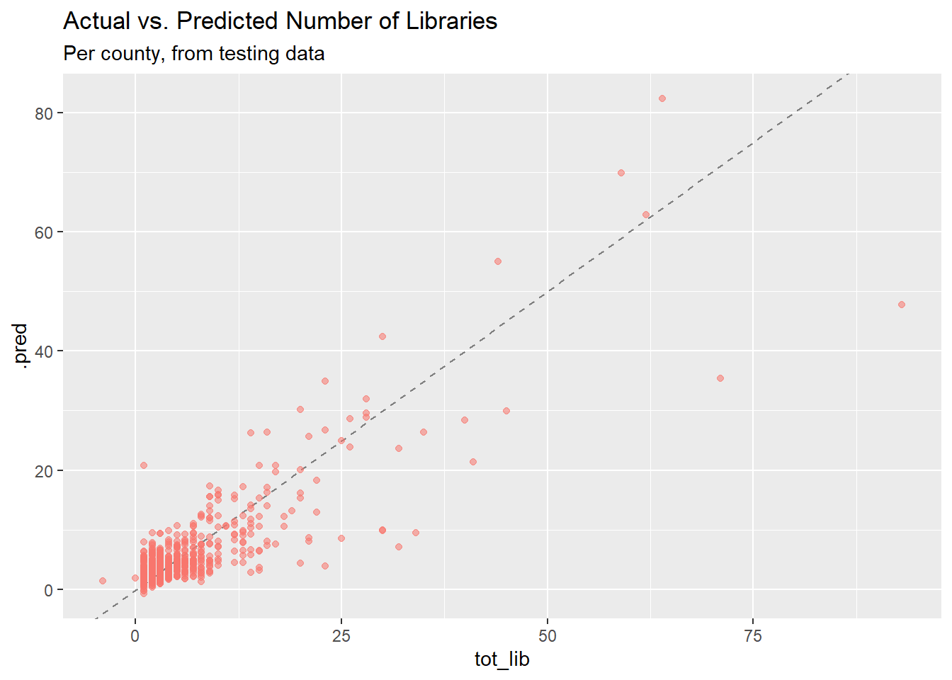
## actual vs. predicted number of libraries (full library data)
full_preds <- final_wf %>%
    fit(lib_training) %>%
    predict(new_data = combined %>% drop_na()) %>%
    bind_cols(combined %>% drop_na()) %>%
    mutate(pred_error = abs(.pred - tot_lib),
           bad_error = pred_error > 30) %>%
    select(name, tot_lib, .pred, urb_rural, pred_error, bad_error) %>%
    arrange(desc(pred_error))

full_preds %>%
    ggplot(aes(tot_lib, .pred)) +
    geom_abline(lty = 2, color = "gray50") +
    geom_point(aes(alpha = 0.3, color = "firebrick"), show.legend = FALSE) +
    ggrepel::geom_text_repel(data = full_preds %>% filter(bad_error == TRUE),
                             aes(label = name), size = 3) +
    labs(title = "Actual vs. Predicted Number of Libraries Per County",
subtitle = "Named counties have large prediction errors") 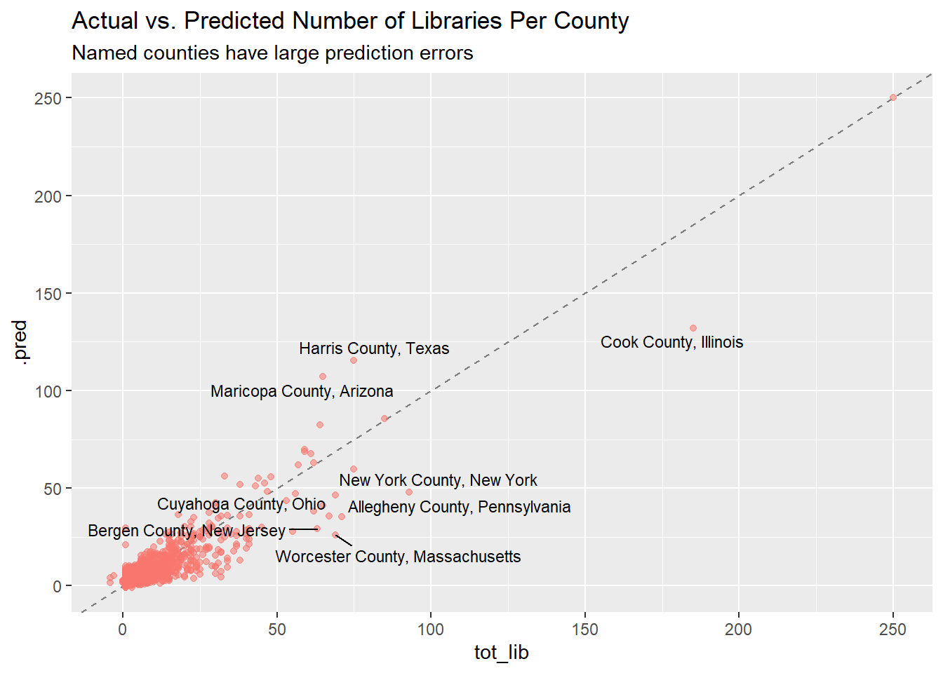
## error plot by urb_rural
full_preds %>%
    mutate(pred_error_perc = pred_error / tot_lib) %>%
    ggplot(aes(pred_error_perc, reorder(urb_rural, pred_error_perc),
               color = urb_rural)) +
    geom_boxplot() +
    scale_x_log10(labels = scales::percent) +
    theme(legend.position = "none") +
    labs(y = "", x = "Prediction Error as % of Total Libraries",
         title = "Prediction Error by County Type",
         subtitle = "County type from NCES REAP Classifications")
## Warning in self$trans$transform(x): NaNs produced## Warning: Transformation introduced infinite values in continuous x-axis## Warning: Removed 8 rows containing non-finite values (stat_boxplot).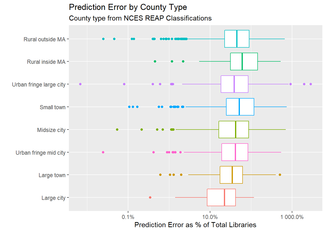
After fitting the model to the original data, it’s interesting to see which counties had the highest error. The counties with the largest error overall are mostly big cities or “urban fringe” of big cities, which you’d expect since they have larger populations and more libraries to begin with. Notably, both Chicago (Cook County) and New York, the two counties with the largest absolute error, have more counties (about 50!) than the model would expect. Nice job!
If you divide the absolute prediction error by the total number of libraries, the model does a poor job of predicting the number of libraries in rural counties.
As a follow-up, it would be interesting to fit a model that is only based on population, and then look at the demographic characteristics of the counties that have fewer libraries than would be expected. I’d also like to spend longer gathering demographic data for counties that might help explain some of the additional variation.
Chad Peltier
My name is Chad Peltier and I the Head of Data & Integration for the US at Janes. I am interested in data science for social good, NLP, and GEOINT data.